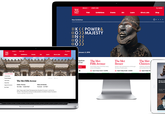
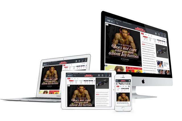
Here at Fi, we sometimes look at industry verticals such as travel through the lens of progressive disruption. So we asked ourselves, what is the future of the airline website?
The Case Study
At Fi we do not have a sales department. We simply rely on our work to generate brands from around the world to perhaps knock on our door. It’s worked for 13 years.
However, there is one flaw. We have a wish list of clients and industries we would love to work with someday. Travel is one of those verticals. So we created a case study to show just a few ideas on how the Airline Website could be, well, just a little disruptive.
Now Boarding: www.F-i.com/Fi/airlines/
The Twitter & Press Reaction
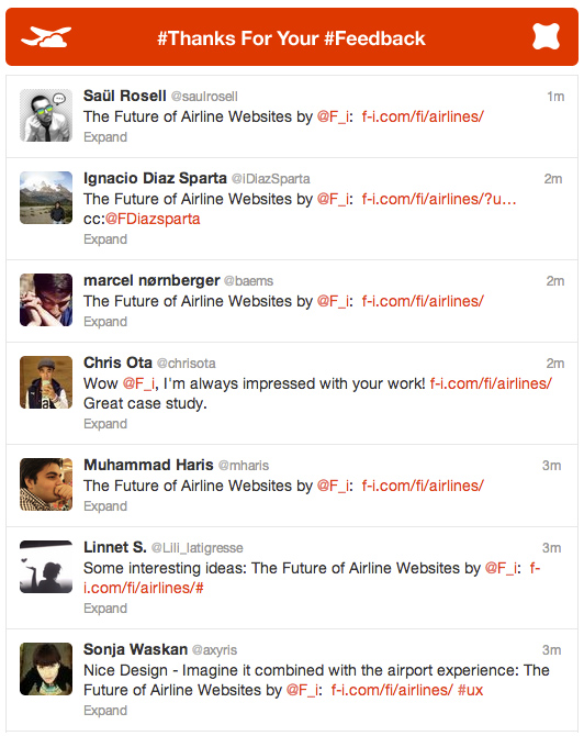
The feedback has been positive and somewhat more viral than we may have expected. The comments seem to allude that we are moving in the right direction and as a creative community we seem to all agree that progressive disruption is needed within the travel space. Wired, .net Magaizne, Creative Bloq, Design Taxi, Adverblog & Tnooz seem to agree.
Here are a few comments on Twitter (July 23rd) from you:
About Fi
We are Fi. A Digital Design Agency that specializes in the architecture, design, and development of award-winning digital experiences. With a specialized focus in creative strategy and interaction design, we approach engagements with a heavy bias towards aesthetics and innovation within the digital space. Founded in 1999, Fi continues to work with some of the biggest brands such as USA Today, Google, and Microsoft.


You are so cool! I don’t think I’ve truly read a single thing like
this before. So wonderful to find someone with original thoughts on this topic.
Seriously.. thanks for starting this up. This web site is one thing that is needed on the web, someone with some originality!
Always makes me wait for the next project
I would hire you! (unfortunately I am not an airline exec.)
Why isn’t anyone doing this? Is UI ahead design ahead of the market?!
Was that an airline website or did I just get back from vacation? Good work!
Brilliant work. You are definitely going to attract a lot of clients and attention from other industries! I’m curious to know how many hours you guys spent on making this case study and how many people that was involved?
This concept blow my mind guys. I am in digital industry more than 6 years and believe it or not I have never seen such integration in a such easy and user-friendly way. Congrats
incredible stuff guys. makes me wanna fly away right now…
Whenever I go to book travel online now, it gives me palpitations. This design is beautiful. The use of flat design makes it stand out as a viable alternative. I really hope this becomes the new standard.
There will be a “old mode” … but seriously this is just scratching the surface. So there is only so much you can get done in a weekend.
I personally love this, but I just can’t imagine my grandma or mom being able to figure it out… just saying
Have you guys stopped reading. Can’t you read what the F-i mentioned in this post “Travel is one of those verticals. So we created a case study to show just a few ideas on how the Airline Website could be, well, just a little disruptive.”
This is totally jaw dropping awesome!!
Would love to see the live version of this, any way we can get a URL?
Love the work – thanks
Looks terrific. Would love to see this everywhere!
Hi, i LOVE this new AirLine website! But i see a few things, not in your CSS/JS/HTML/PhP, but more in the reality, its going to take a lot of staff to keep your photos up to date along with many other things, new items will be needed. This is Destructive Criticism. Not trying to be harsh.
Awesome guys! Really like the video. It’s been long overdue someone woke up the travel industry! In 30 years of internet booking your holiday is still a pain in the *ss.