Imagine a product site that is meant to inspire you. A site that showcases and celebrates creativity from all over the world. And rewards loyalty to the brand. A site that helps you find a product that best matches your needs. And knows how to nudge you in the right direction. Imagine.
Here at Fi, we’re in love with Wacom products – the tools that help us do what we do best as a creative agency. So when Wacom told us they were launching new product lines and expanding into the broader marketplace for everyday users, we put all our efforts into creating the most intuitive and beautiful site experience possible…
What if you could inform professionals and still engage the public?
It’s important to consider the differing levels of experience with your brand. In this case, Wacom was already a global leader in producing useful, intuitive creative tools and interfaces for serious creative professionals. But they had recently expanded their product suite to include tools for everyday use among the general public, and needed a way to engage those unfamiliar with their brand, without neglecting the creative professionals who make up the bulk of their existing user base.
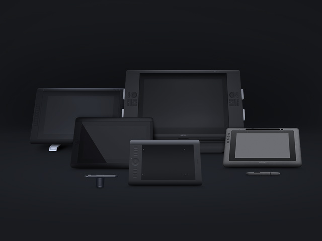 The sleek, beautiful look of Wacom’s products eased their translation into a harmonious digital experience.
So the challenge was to present their multiple, multi-faceted product lines in a way that served the needs of the specific audience for which each line was created. A single, global experience to engage existing consumers and fans, while welcoming first-timers to the world of Wacom.
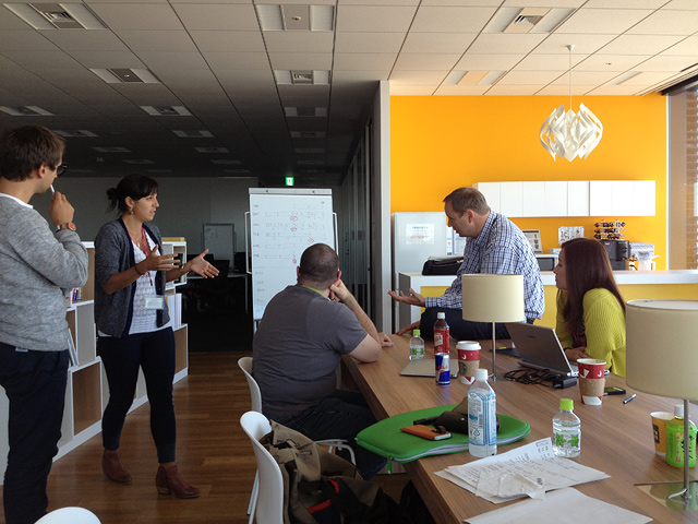 Getting the Wacom and Fi teams together was no easy feat. Here members from USA, Japan, and Germany meet to hash out some creative concepts.
Why stick to the norm?
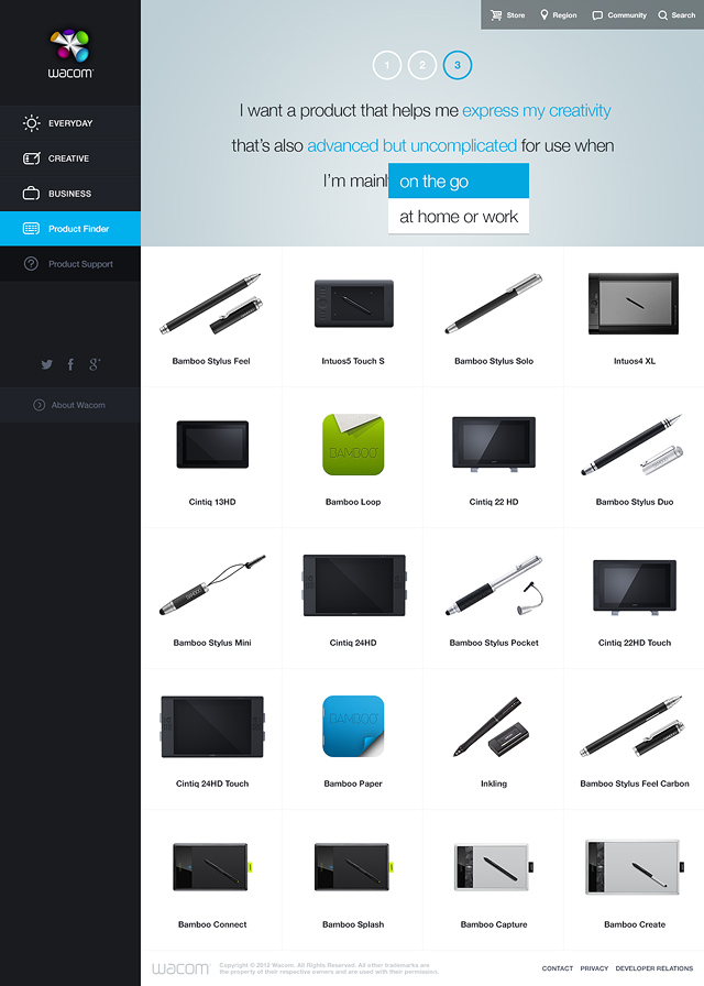
What if we created an entirely new category of product site? Today’s product sites basically fall into three main categories. Utilitarian sites like Amazon put the products on the equivalent of store shelves, and base their sales model on peer reviews. Storytelling sites like Apple focus on the beauty of the product, and base their sales model primarily on brand recognition and familiarity. Lifestyle sites like Bang & Olufsen push a cohesive luxury lifestyle that sells their products as status symbols. There were certainly opportunities to follow one of these established models, but we saw an entirely new category to suit the specific needs and objectives of Wacom… Let’s call it the Experiential site. We’re thinking: let the user experience what it’s like to own and use the product. Of course the user is never alone, the site helps guide them to the correct product through intuitive suggestions and a new, humanised product finder.
Is a homepage still relevant?
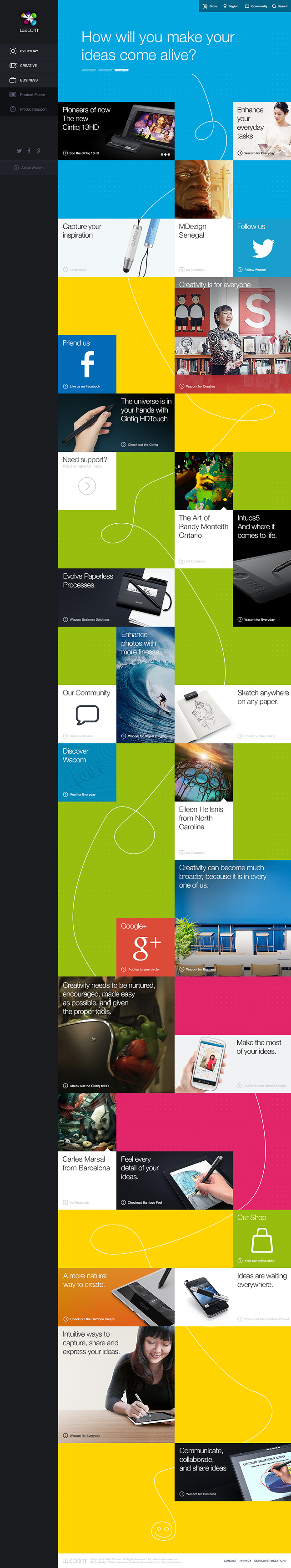
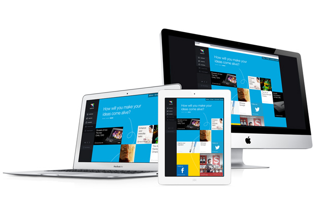
We wanted to see if we could make this old staple more about exploration and discovery. Of course it’s a driving principle that any successful website must offer quick, easy access to exactly what a user is looking for, without having to search too far. However, based on the highly creative nature of Wacom’s product offerings, we looked at creating an additional layer to the experience. Knowing that many site visitors may be seeing Wacom’s products, and experiencing their brand, for the very first time, we knew the first impression had to be equal parts information and inspiration. Striking a balance between utility and experience, we replaced the homepage with a discovery page: A dynamic starting point that organically flexes toward whichever user type encounters it.
Can navigation be both simple and robust?
Picture a friendly usher, only there when you need them. A site’s navigation should serve all types of users equally, while maintaining utter simplicity and economy of space. Beyond that, there’s additional opportunity to intuitively guide the user, based on small (optional) bits of information gathered. Through a combination of sticky nav items, jump navigation, and a layered information architecture we offer many different ways to explore varying levels of detail within each product line.
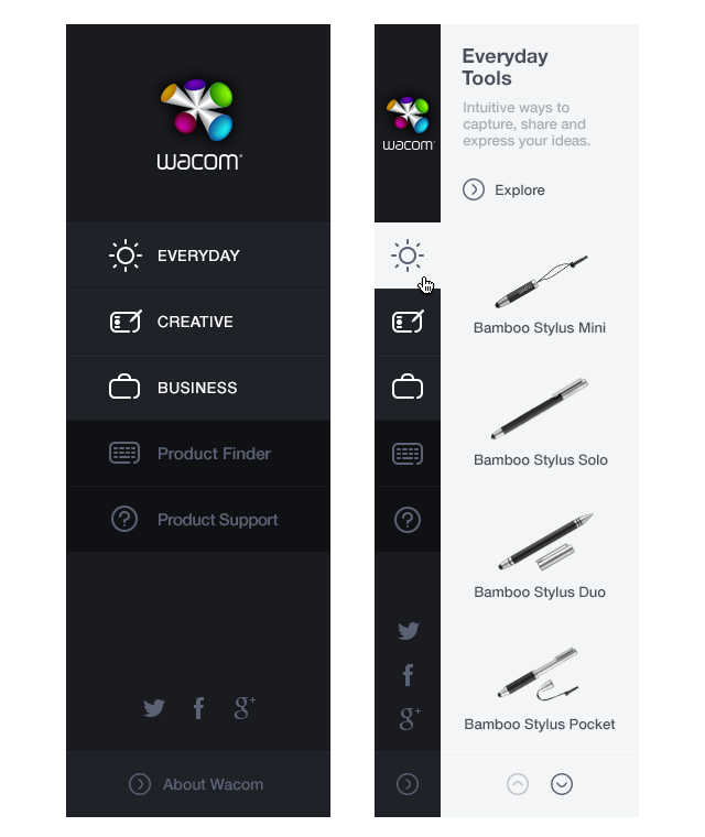 The pictorial navigation allows you to see the product before you click to explore the details.
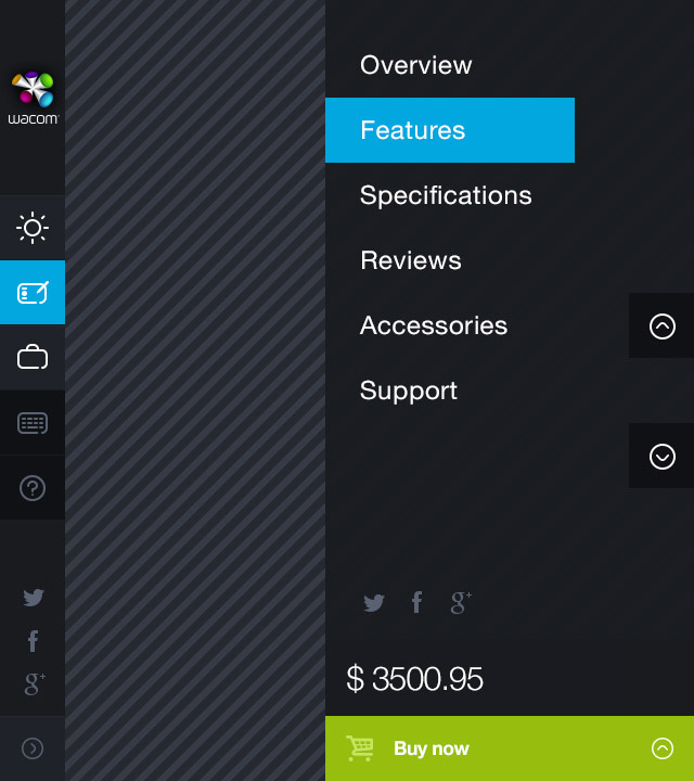 A pop-out, jump navigation on the side of the screen allows users to scroll… without scrolling.
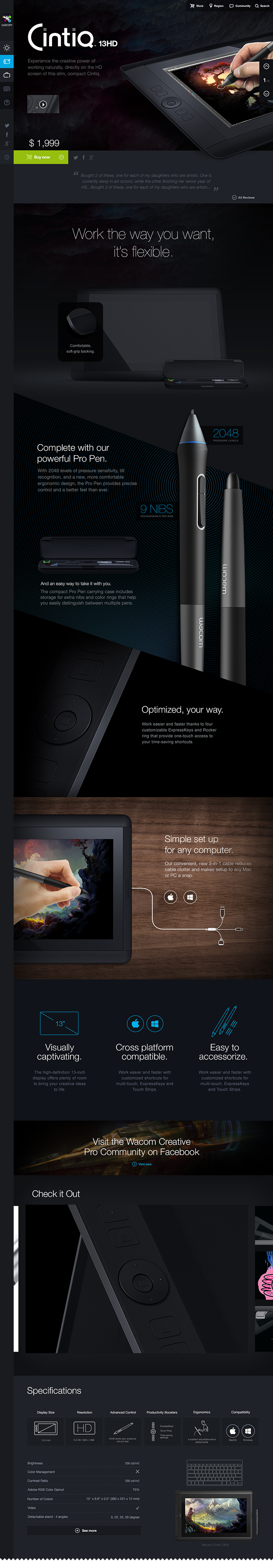
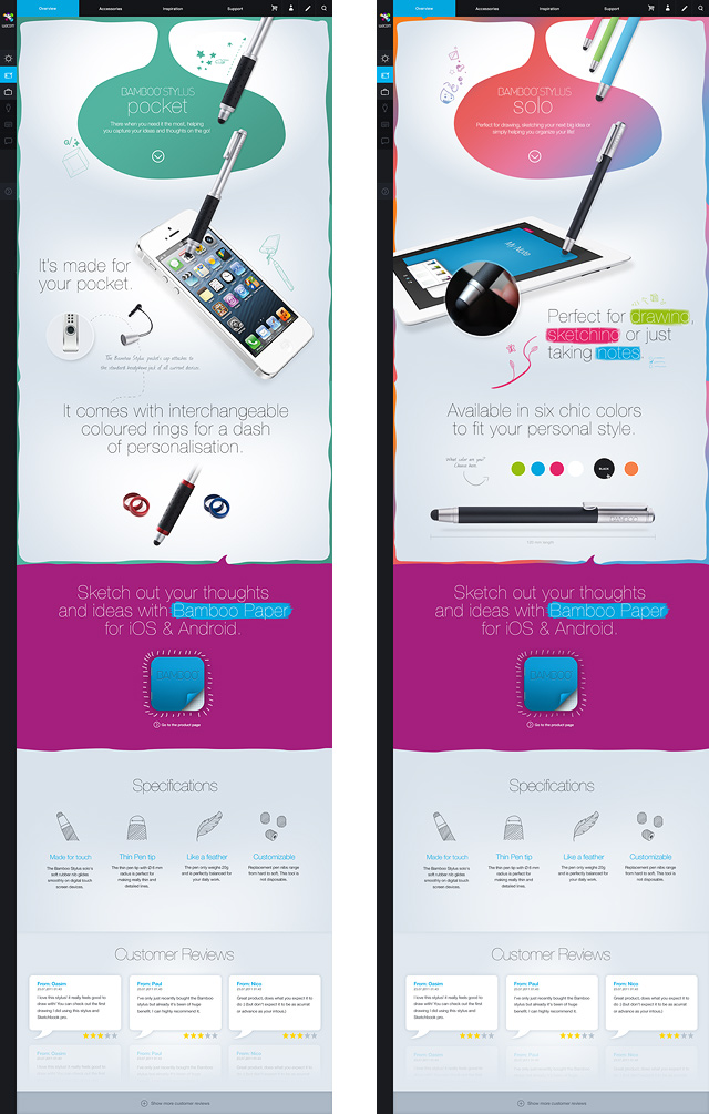
Can a product page offer more than specs?
Let’s leave the selling to the salespeople. Put the product experience first, and allow the user to dig deeper if and how they choose. Friendly, relevant and useful messaging replaces pushy sales and marketing speak. On the page’s vertical plane, users get the big idea first, they experience a sense of the product in action, then obtain deeper levels of detail the lower they scroll on the page. Let’s provide the user an interactive thread that they can choose to pull as much or as little as they want.
Why not create a whole community?
Others’ work should inspire your own, so let’s facilitate those interactions. Creative people are essentially a global collection of like-minded people interested in manifesting things that did not previously exist. Leveraging the broad reach and intense interest in social media platforms, and the existing hardcore fanbase for Wacom products, it was only natural to stitch those together into the new Wacom site. #MadeWithWacom ties into the site’s content offering, providing real-life examples of how others are using the product suite in their own lives, creating a real-time sense of community and inspiration.


Why not have fun, too?
We love sharing behind the scenes photos, after all, the human process can be just as interesting as the creative one.
Beautiful images, videos and cool new icons don’t create themselves. Fi sent part of its Wacom team to Tokyo to gather as many assets as possible. Their schedule included having fun, meeting with Wacom and taking lots of HD photos – including some silly ones!
 Johnny and Irene couldn’t help but stop for a photo on the way to the Wacom office… Anton, is that you?
 We created extremely detailed 3D product assets.
 Subway rides can get a little monotonous… But not when Fi is involved.
 This is the direction the team was going during the initial discovery phase.
![]() The new iconography will also be used in the brand packaging.
The new iconography will also be used in the brand packaging.
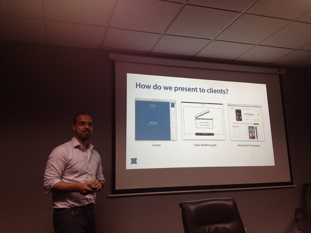 Communicating with clients is just as important as communicating with each other.
 What’s out there? Ideas? Surely not?
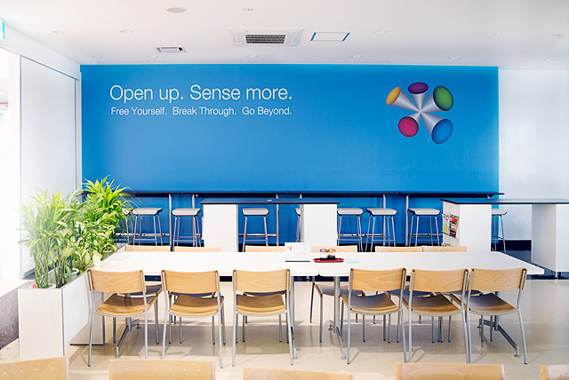 The Wacom Cafe. Inspire yourself while you eat, perhaps?
Want more?
Visit Wacom.com for the complete experience.
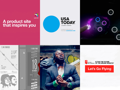
Also check out our similarly disruptive approach to USA Today’s redesign, and recent Airline industry exploration.
About Fi
We are Fi. A Digital Design Agency that specializes in the architecture, design, and development of award-winning digital experiences. With a specialized focus in creative strategy and interaction design, we approach engagements with a heavy bias towards aesthetics and innovation within the digital space. Founded in 1999, Fi continues to work with some of the biggest brands such as USA Today, Google, and Microsoft.
Some people will def bitch about breaking the norm, but this website is beautiful. And once you start using it, it’s pretty functional too. Let’s face it, the Wacom site is for creative people. This is a pretty bold design.
Thanks designed for sharing such a fastidious idea, post is nice, thats why i have
read it fully
it’s look like amazing =)
I tried to find the latest large tablets but had a great deal of trouble. The site looks great but is not really usable.
Bring it in
Beautiful chaotic design.
but with all due respect, usability so confusing and not intuitive… I do not understand how anyone could approve it.
Why didn’t you make it responsive? Buy buttons before the specs…and I have to scroll to the bottom for the product specs? On small screens you can’t really scroll through the images… Also, it’s hard for me to comment on this blog as the comment buttons as not here on 768px height.
Tried to find drivers for my wacom intous 4 on the new web, can’t do that.
Ace work guys!! Love the new branding and consolidated direction you are helping Wacom to take! Big up from a fellow Swede In Japan!
This is an awesome project!
Great!
What a great peace of work, just love the UI interface and over all feel of the site when working it. Class.
It’s look grate but it’s very very confusing site… and usability sucks.
its not that confusing.
this site….is….confusing as hell. Even the comments box u can scroll down to see the submit button….except the very top of it.
Looks really nice! Though i was looking for that responsive-genius But can understand that the target visitor might not visit from a mobile or tablet.
Good job!
Great site, quick question though – why have you decided to remove transitions on Internet Explorer? Also what language do you use for them, jQuery?
No, don’t like this one. Flat design doesn’t fit your works.
absolutely amazing job!
very inspirational, especially ex-home page, product finder and navigation. well done!
But where are all those slick transitions between pages showed in the video?
Wow! Great Job!
It is indeed very inspiring! Excellent work, really beautiful. I just love it!
Chapeau! Excellent work and case study … WE <3 F-I
*Quick note: The Intous4 XL DTP page is missing a title.
The site is magnificent. Long have I wished for a wacom.com re-design.
Quick note: The Intous4 XL DTP page is missing a .
I love you!
stunning!
Once again, more magnificent work from Fi. Panels are used a lot today, but Fi makes them useful instead of just eyecandy.
очень круто! как и всегда.
Great Work, love it!
I’ve been waiting for this since the announcement at OFFF and once again you delivered something stunningly beautiful in every possible way. Congrats.
Simple, awesome! Perfect UX, and pro UI!
Congratulations!