
Our work with USA Today’s site redesign is featured in the March 2013 issue of .net Magazine as a How We Built technique case study. Read how Fi’s Global Director of UX & Strategy Irene Pereyra and Global Creative Director Anton Repponen adopted a single-page app structure for the radically redesigned site.
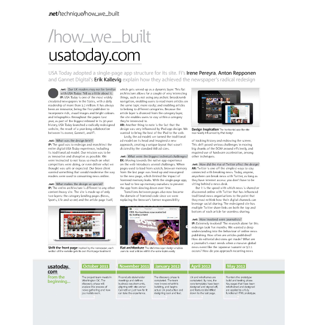
The project brief was to redesign and re-architect the entire digital USA Today site experience using only two layers: the category landing pages and the article page itself. Read below on what made this design so special and the technical challenges that lay in front of the team.
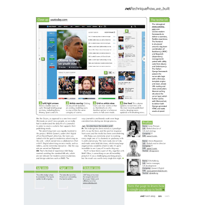
USA Today‘s homepage boasts dynamic functionality including left and right arrows inspired by the iPad design, an article overlay enabling readers to stay within the same category of stories, a grid vs. article view and a live feed on the right column that keeps readers updated with breaking news.
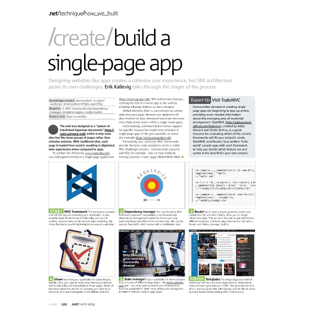
Former Fi alum Erik Kallevig even contributed to the technical piece since he was the senior developer who worked on the site before moving over to the client side. Below Erik walks through the site creation process.
Watch the new USAToday.com come to life in this video walkthrough.

[...] USA Today’s simple page app structure was the topic of discussion in the publication’s How We Built [...]
[...] USA Today’s simple page app structure was the topic of discussion in the publication’s How We Built [...]
[...] USA Today’s simple page app structure was the topic of discussion in the publication’s How We Built [...]