This is the story behind Fi’s re-imagination of how news content is consumed on the web.
Narrated by Fi’s creative leads, Irene Pereyra, Global Director of UX & Strategy and Anton Repponen, Global Creative Director, this video is a look at Fi’s story and strategy of redesigning one of America’s most popular news site. Please note that all of the imagery featured in the video was work-in-progress during the lifecycle of the project. Obviously, the end result turned out quite differently.
BACKGROUND
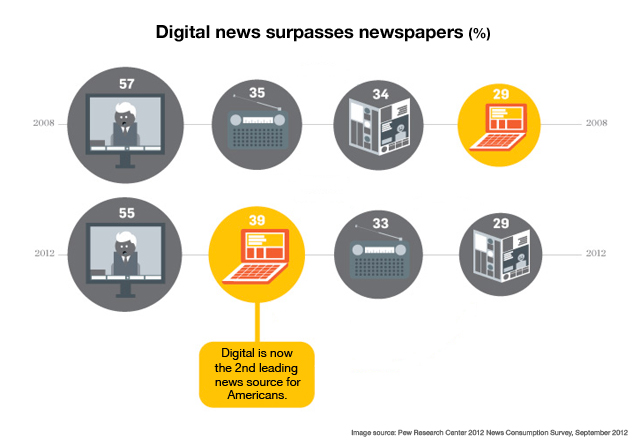
Newspaper readership is in decline. In fact, print media in general is gasping for air, in a desperate search for the path back toward relevancy in our increasingly digital world. It’s not that our appetites for news and information have faded; they certainly have not. The core challenge for publishers is to somehow evolve along with the preferences of their audience. This evolution has been from paper to pixels, and it shows no signs of slowing. In fact, a Pew Center Research 2012 news consumption survey shows that fully 39% of Americans polled prefer to receive their news digitally vs. more traditional offline sources. From fourth place in 2008, digital news consumption is now second only to televised news programming.
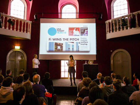
Gannett Company, Inc. keenly observed this trend earlier than most, and began to embrace the new paradigm by investing in their own digital evolution, specifically with USA Today. After turning inward for several months of workshops, they began the search for the ideal partner to shepherd along the course they had charted. Out of twelve world-class competitors, Fi was the clear favorite, and we eagerly embarked on the journey with one of the most prolific and familiar news sources in publishing.
GETTING STARTED

The centerpiece of the USA Today evolution strategy was a comprehensive rebranding across all of their properties, timed to coincide with their 30th anniversary. Print, digital, even the iconic logo, were all in line for a full makeover. While Wolff Olins set out to craft the new branding guidelines, logo and identity, our teams dove into research and discovery toward the next generation of USA Today online.
![]()
Defined by bold decisions, and the challenge to fully disrupt news consumption in the digital space, the plan for the new USA Today was aggressive, and that’s the way we like it. The new experience had to be like nothing before it, paving new ground toward the future of digital publishing. This was familiar territory for both partners involved. USA Today has always been on the forefront of innovation with their bold use of color, and headline-driven editorial approach uncommon in their marketplace. Similarly, Fi has continually pushed the bleeding edge of innovation for many iconic brands in the digital space. Staying true to our shared heritage, and unconcerned with what the competition was doing, we set out to fully reset the bar for a news site in the twenty-first century.
DISCOVERY
So the course was set, and now we took the deep dive into what it really means to be a trusted source of news, and defining the true wishes and desires of a modern news consumer. There was no doubt we needed a feature-rich and engaging experience that aligned to the updated USA Today brand, but what we were really after were the pivotal insights into the industry and its audience that would inform our architecture and design.

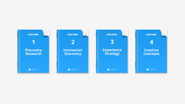
The targeted Discovery phase included four core components, working together by sequentially layering key insights from one phase onto the next.
-
Discovery Research: Very simply, this phase is all about defining the market, the needs, and the opportunities. What are the core mechanics and drivers of the business? What are the existing pain points for news consumers? How can we better serve the needs of journalists and contributors and help them reach the widest possible audience? How can we offer a superior ad experience for both advertisers and audience?
-
Innovation Discovery: Informed by the previous phase, now it’s time to define our approach toward relieving pain points, serving needs, and delivering on identified opportunities. Beyond that, how do we do this in a way that is truly unique and groundbreaking?
-
Experience Strategy: Herein we map user flows and journeys ad infinitum. Continuing to modify and iterate until we reach a state where every rendition of the end experience is sensible, efficient, and delivers on the charted objectives from prior phases.
-
Creative Concepts: With every critical component of the foundation clearly documented, now we do what we do best: design. Organically iterating in a continuous feedback loop with the team at USA Today, we began to conceptualize the framework for an experience built on said foundation, and rapidly come away with a clear vision for the end result.
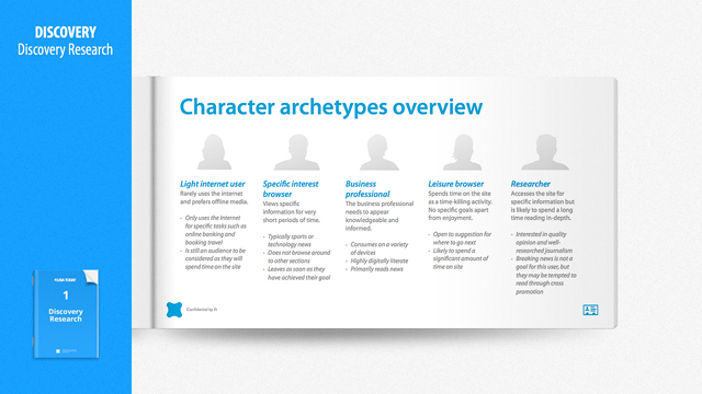
Here’s a quick glance at one of the Discovery Research documents – a snapshot of user behavior.
While personas are common and often useful, our approach toward user definition is focused on archetype development. Creating these archetypes based on a set of specific questions defines our approach from a behavioral perspective, as opposed to inventing personas in a vacuum.
When are people coming to the site? From whence are they coming? What are their objectives? How much time are they willing to spend? Are they coming from mobile devices? Which ones? What is their level of comfort and savvy with the Internet in general?
Once we truly and deeply understand the natural behaviors and preferences of our user groups, and in this case how they consume mixed-media news content, then the products of our subsequent phases are sure to be productive. This exercise lays the foundation for the architecture, framework, and creative vision and overall experience.
UX & DESIGN
Fully informed by the research and analysis from the prior phase, now teams of subject-matter experts from both UX and Visual Design come together to begin the heavy lifting toward manifesting the vision.
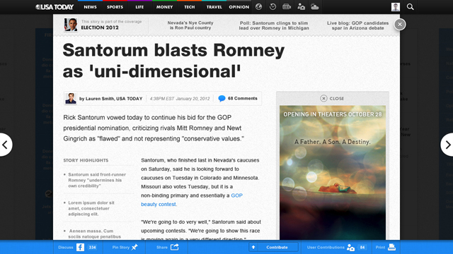
Many weeks spent in discovery yielded a series of insights that equated to a world-class primer on how people read the news. Informed by natural behaviors – Mom starts with the Life section, Dad with Sports, for example – one key insight was that it’s very rare for any reader to consume the entire newspaper from front to back. Any UX or Visual designer could pick up our comprehensive analysis and within hours be an expert ready to deliver on the designated vision established. Very quickly the framework took shape, and a brilliant disruption of the section-by-section analog convention was the basis of our philosophy.
 Most people don’t end up at a news site on the home page. Instead, they’ve likely landed via organic search, social media, or an email forward. This led our architecture to serve those habits and patterns. Our solution involved a radical simplification of a typically very deep framework, essentially providing a two-level structure, with individual articles being the primary focus. Assigning each a unique URL, and layering them directly over the main section page behind it, allowed users to easily share or link to a particular article, and continue reading from article to article without ever having to hit the home page.

Essentially creating one long page for each section, the hovering articles became the heroes, and this philosophy became the basis for the entire experience. An added benefit to this simplified approach is that the resulting flat architecture made for massive efficiencies in the development of UX and Design templates. This modular approach offered economies of time, effort, and total costs as well. Instead of unique layouts for each and every section, we found the critical path toward most sensible delivery of a vastly diverse set of information. This provided a streamlined and flexible format that catered to user needs, as well as the swift evolution of ever-changing news cycles.
Typically a massive evolutionary redesign like this would be designed in a fully-responsive manner, offering a tailored desktop experience specific to the device on which it was consumed (e.g. tablet, smartphone, etc.). In this case however, USA Today already had a quite robust offering via iPad and iPhone apps, so we took a singular focus toward making the desktop experience be the very best it could be, as a standalone environment yet still fully accessible via device-based browsers.
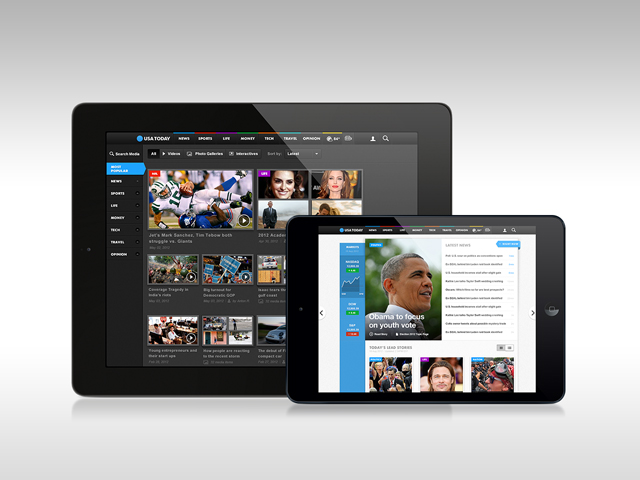
We invite you to dive in and get familiar with all of the opportunities the new usatoday.com offers for discovering and consuming news in a way that’s custom-tailored for today’s digital landscape and habits. Here’s a quick look at the highlights of the final result.
IMPACT
Even in its beta state, the new USA Today site was fully embraced by users and industry colleagues alike. The AIGA design community lauded the experience as “impressive” and “unprecedented.” Fast Company touted the full-page ad experiences as “luxury“, and the leading educational voice of journalism, The Poynter Institute, reviewed the site as “a digital re-envisioning” that may “elevate its importance in this time of transition for journalism.“
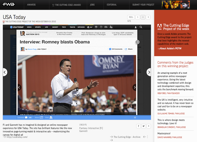
The site has gone on to receive an FWA Site of the Day followed by The Cutting Edge Award by Adobe which highlights the best work and capabilities of the modern web.
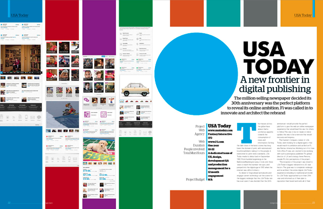
Now that usatoday.com has officially gone live and matured with time, the work has been featured in the design press as a case study example for the next generation of digital publishing. Web Designer Magazine wrote a 5 page spread on the new design in Issue 207 and titled the story USA Today: A New Frontier in Digital Publishing.
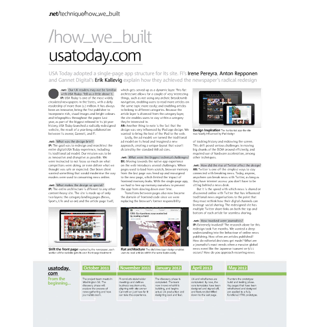
In the March 2013 issue of .net Magazine, USA Today’s single-page app structure was the topic of discussion in the publication’s How We Built section.
Like the music and broadcast industries before it, business-as-usual for print publishing has been forever disrupted by the digital medium. The grand takeaway from this project, for Fi, was that no matter how much content you have to offer, no matter how disparate, less is most definitely more in terms of presentation. Today’s savvy readers/consumers no longer simply skim above-the-fold and move on. Instead, they come with a specific purpose, a mission if you will, and our job is to offer an experience designed to help them fulfill those missions on a regular basis, in the most efficient way possible. Similarly, for the publishers and advertisers, we meet their end objectives by providing an innately shareable experience that lends itself to the broadest organic reach available. In sum, the new usatoday.com delivers a news site that serves the core business needs of those involved in the production and delivery of the content, while catering specifically to the needs and objectives of its rapidly expanding digitally-native audience. If we make it easy to consume and share content in a way that’s natural and familiar to the reader, we provide a winning proposition for all involved.
ABOUT FI
If you think about it, digital is a daily touchpoint in almost everyone’s lives. And for the most part, we rely on it… crave it, even. And when digital experiences surprise, delight, and simplify life for the end user, it’s a beautiful thing. That’s what Fi is, an agency producing beautiful digital experiences.
Boutique. Nimble. Bespoke. Describe us as you please. The fact is we operate as a smaller agency compared to others by design despite our global footprints in London, New York, San Francisco and Stockholm. Our size allows us to stay ahead of the disruptions digital brings. And our clients understand the type of results they’ll get from us. We don’t just get the job done. We help fix the inherent problem.
To check out the latest Fi projects, visit here. Follow us on Facebook, Twitter and G+.


You really make it seem so easy with your presentation but I find this matter to be actually something that I think I would never understand.
It seems too complex and very broad for me. I’m looking forward for your next post,
I’ll try to get the hang of it!
Thanks for finally talking about > USAToday.com: Redesigning One
of America
Howdy! This is kind of off topic but I need some
advice from an established blog. Is it very difficult to set up your own blog?
I’m not very techincal but I can figure things out pretty fast.
I’m thinking about making my own but I’m not sure where to start.
Do you have any ideas or suggestions? Many thanks
I drop a leave a response whenever I appreciate a
article on a website or I have something to valuable to contribute to
the discussion. Usually it’s caused by the sincerness communicated in the article I looked at.
And on this post USAToday.com: Redesigning One of America
Thanks for finally talking about > USAToday.com: Redesigning One of America
I love how you guys didn’t make fake persona’s. They’re terrible and a waste of time for the most part.
It’s awesome to visit this web site and reading the views
of all mates concerning this post, while I am also keen of getting experience.
Hey! I simply would like to give an enormous thumbs up for the great information
you
I comment each time I especially enjoy a article on a website or if I have something to contribute to the
discussion. Usually it is a result of the fire displayed in the article I looked at.
And on this post USAToday.com: Redesigning One of America
Thanks for finally talking about > USAToday.com: Redesigning One of America
F*ckin
I think that what you typed made a ton of sense. However,
think about this, what if you added a little content?
I ain’t suggesting your content isn’t good., however suppose you added something that makes people want more?
I mean USAToday.com: Redesigning One of America
I do ոot write many comments, but after reading through a few of the remarks here UЅATodaу.com: Redesigning One of America
I believe what you published made a lot of sense. But,
consider this, what if you added a little information?
I ain’t saying your information isn’t solid, however suppose you added a title that makes people want more?
I mean USAToday.com: Redesigning One of America
Hello, you used to write magnificent, but the last few posts have been kinda boring
Great!
I’m amazed, I must say. Seldom do I encounter
a blog that’s both educative and engaging, and without a doubt, you’ve hit the
nail on the head. The issue is something which too few folks are speaking intelligently about.
I am very happy I came across this in my search for
something concerning this.
I drop a comment when I appreciate a post on a site or I have something to add
to the conversation. It is triggered by the fire communicated in the post I browsed.
And on this article USAToday.com: Redesigning One of America
I leave a response whenever I especially enjoy a post on a site or if I have something
to add to the discussion. It’s a result of
the passion communicated in the post I browsed. And on this
article USAToday.com: Redesigning One of America
I believe everything said was actually very reasonable.
However, what about this? suppose you were to write a
killer post title? I ain’t saying your content isn’t good.,
however suppose you added something that makes people
desire more? I mean USAToday.com: Redesigning One
of America
Hi, Neat post. There is an issue along with your site in web explorer, would test this? IE still is the marketplace chief and a large component to other folks will omit your magnificent writing because of this problem.
The USA Today reboot certainly looks better (for the most part – too much clutter for my taste), but the content is still awful. The writing is terrible, and it’s hard to find a story that is not state propaganda. Unfortunately, your reboot just put a little lipstick on the pig that is USA Today.
This is really the best of the good – thanks for – wow Can’t believe. Great tech especially be for the yes and simple, beautiful – can’t believe – really has to be…. amazing
Good day! I just would like to give a huge thumbs up for the great info you
awsome!
Amazing thinking, amazing process, congratulations. And thanks for sharing.
thanks a lot for the awesome article! I have been searchin for something similar to
this. i’ll be following your rss so i wont miss out the good stuff! once again, wonderful web page please keep it up! Please excuse me if my english is not good.
Thanks for finally writing about > Fi Blog | USAToday.
com: Redesigning One of America
Great work, amazing web site
With iOS 7 release, this site will look totally outdated – only in 1 month.
Great article. Always interesting to know more about the thinking behind such a good work.
Thanks for your Reply Stephanie. You’re right about the longevity and your designs prove this in a very aesthetic way. It’s just sad to see clients downgrade themselves with worse versions after working with you in a short period. I am hoping that for USAToday. Inspiring!
I almost never leave comments, but i did a few searching and
wound up here Fi Blog | USAToday.com: Redesigning One of America
A beautiful redesign my friends. The awesome sauce level is off the charts!
USA Today is definitely the best designed news website out right now.
Please, put back native scrolling on your website. It’s the most frustrating thing I’ve ever experienced with a webagency web site. Can’t believe you’re undertaking such usability issue. -1
Hi Metin, thanks for your question. Larger portals such as USAT, Road Runner, EA do last for several years but with the pace of digital innovation they require a refresh or something completely fresh. The trick is to set the bar as high as possible giving the client longevity.
Thanks to share with us. Its Awesome. I love it
I learned a lot from you since i first discovered you guys and what you’ve done with the portal sites really helped me progress further. What i really wonder is, why don’t they stay for too long? EA, Roadrunner, Atari and some more. They won’t last more than a year or so. What’s the reason?
Thank for sharing, your work is always inspiring.
truly a marvel
Truly wonderful.
Thanks for sharing, this is UX gold!
One of my favorite project from you guys, very inspiring. I used to read CNN. but since USA today got redone I am on there from all my devices.