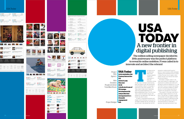
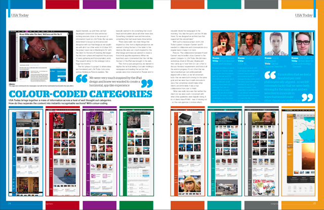
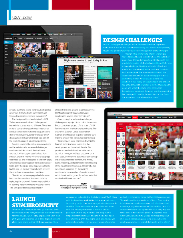
Our work with USA Today’s site redesign is featured in a 5-page spread in this month’s issue of Web Designer, the UK publication for creative web design enthusiasts and professionals. If you’re not familiar with the work yet, check out the award-winning site in the video below.
Go ‘behind the scenes’ with the team responsible for the publisher’s digital rebrand and walk through the timeline of work. Follow our strategy, design and development of how we took a content-heavy publishing site and re-engineered it to make online news reading simple, intuitive and usable.
We love how the editor colorfully displays the story in the same fashion the USA Today site experience delivers.
Get to know two nuances that helped define the work: the design and launch date.
For the full digital March 2013 issue, you can purchase and download it here.


Thanks for posting such a vital information in the context of web design….please give some more information on this..
Awesome! Very nice video. I enjoyed it a lot. You have done awesome job. It’s been really great to be here.
http://www.tagteamdesign.com/
Awesome!!
到底是
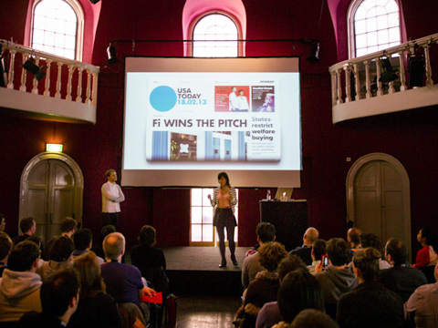
I’m with Von! I know the Fi team is putting the finishing touches on it as we speak! I’m curious to know what level the Fi team collaborated with the Wolff Olins agency.
I don’t get this? Why is Aksam Newsletter using the
entire USA Today scripts and web site? I don’t like it!
Still waiting for the holy case study of UT