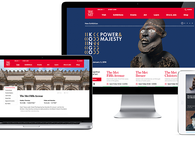
Surviving and thriving in the digital business over the past 15 years you get to see some interesting client briefs. They all start with an email that gently touches down in our inbox such as this one:

So two things go through our minds upon receivership.
- Wow, this is the Met Museum, the actual Met, asking us to consider touching their beloved jewels and priceless archive of humanity’s creative achievements.
- Oh oh!
So why “Oh oh!”?
In NYC alone there are phenomenal agencies capable at doing this work. We knew instantly this was an opportunity we could not pass on. Winning and creating the project will certainly become part of our legacy just like MTV.com, USAToday.com had in the past. But, and here come’s the “Oh oh!” part, we knew that Met being the prestigiously run organization it is has most certainly asked those other phenomenal and much larger agencies, the Huge Inc’s, RGA’s, AKQA’s of the world. We knew they too would be buckling in for the fight and it was going to be a brutal one.
Our advantage with clients these days is the fact we are tiny, we are design lead not business lead. When we are hungry there is no stopping us. And todays client is looking for that specifically. But finding an agency with that setup and model that actually has the competency and experience in pulling this off gives the client very few choices.
Our team and partners gave it everything. We won. It was an awesome feeling to have been selected by The Met.
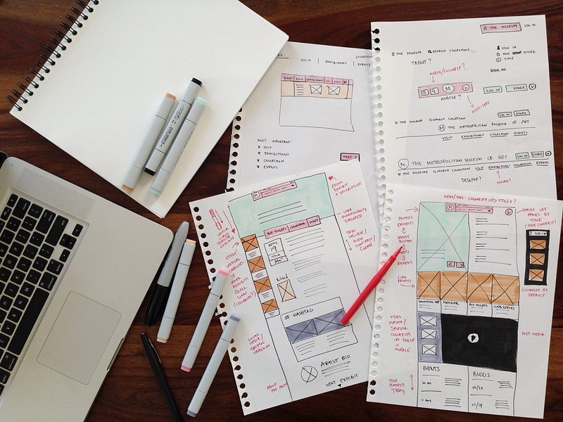
Redesigning a landmark New York City institution
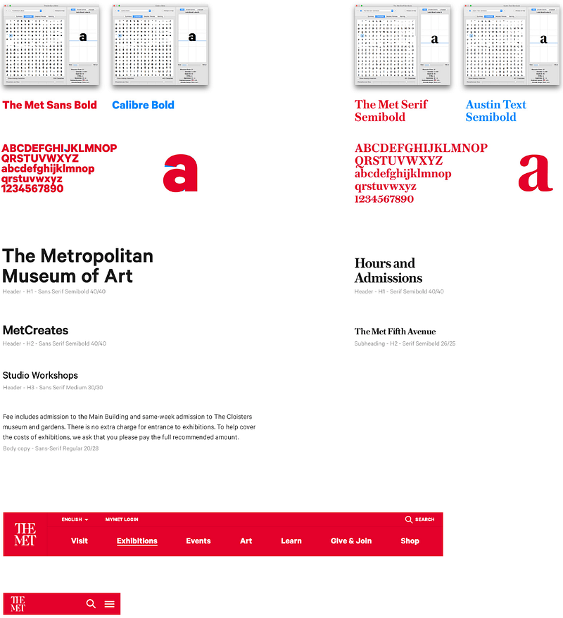
One of the best part’s of any digital endeavor I find is designing the visual online identity and our design team did a great job with The Met. More and more the online identity is spear heading an entire companies brand.
Mobile was a big focus
Right “off course it was in this day and age” you say, but consider the Met’s visitors are walking around and in real time looking at displays and their mobile devices genuinely add value to their experience.
Find. Browse. Plan
It had to be simple to find exhibitions. A large portion of Met’s users are looking for something in particular. Combined with browsing events and planning your visit we offer users to explore world class collections online.
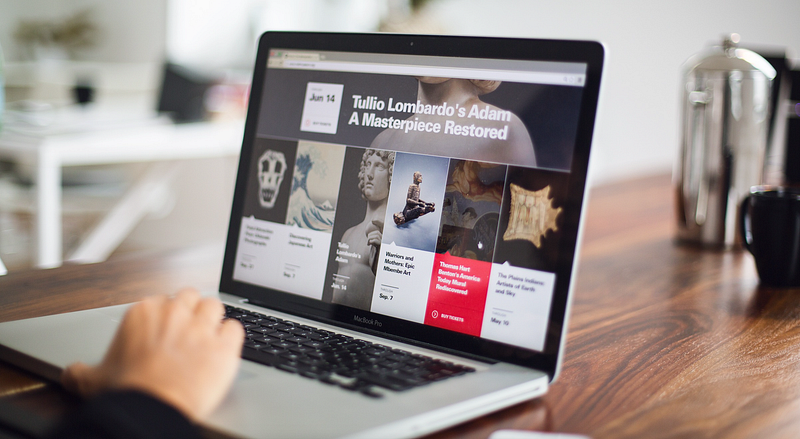
Adaptive Content
While at home for example on a tablet, the content adjusts to the location and time of day as well as the device.
To commemorate our little endeavor we published our Met case study this week here. A special thanks to the team at Fantasy, our partners and the Metropolitan Museum of Art. The project is currently a finalist in Fast Company’s Innovation by Design Awards.
About
Fantasy is an independently owned human-centered UI & UX firm in Silicon Valley and New York City. interact@fantasy.co
Creating product UI within automotive UI to artificial intelligence, consoles to mobile operating systems. We partner with Xbox to 23andMe, Google to Twitter and Spotify to Huawei. Our mission is to significantly impact the user experience in every-day products through bold design.
More thoughts from us
Our thoughts on the future of online travel.
Our thoughts on the future of the airline website.
Our thoughts on the future of online shopping.
Our thoughts on the future of online healthcare.
Our thoughts on the future of automotive UX.
Say Hello!
Fantasy on Dribbble
Fantasy on Linkedin
Fantasy on Twitter
Fantasy on Facebook
