Irene Pereyra, Director of UX and Strategy, rounds up 10 top tips to help you deliver an amazing interactive user experience in .net Magazine.
These days, building websites or applications that attract and retain customers has become somewhat of a science. For people who aren’t well versed in the digital space, I often compare the work that I do as a UX designer to an architect. Like the architect who builds your home, my UX team builds a comprehensive blueprint, which outlines every single detail of the site’s features and functionality.
But it’s not a one-shot deal. Getting to an intuitive and engaging user interaction requires many steps. Here’s my top 10 tips to help you deliver an amazing interactive experience for your users.
1. Design for the user, really
Back when online interaction was still in its infancy, and not much thought had been given to whom we were designing for, users were all too willing to spend their time learning the interaction required to complete tasks on websites. If users were confused, people often assumed they just weren’t tech savvy or well-informed on how to navigate the internet. As more and more websites, mobile devices and tablets started popping up; users weren’t as willing or patient to “learn” on their own. Nowadays, you’ll see more users becoming frustrated and even angry when they feel a product, application or website is substandard – and rightfully so.
It’s tempting to design with your own preferences and tastes in mind. But that won’t help users complete tasks on the site if they have a whole different set of preferences and needs. Think about what users want to do and help them complete those tasks in the easiest and most intuitive way possible. Are they browsing? Searching? Gaming? Watching video? Trying to complete a task? Looking for specific content? It’s the UX team’s job to look at the entire experience holistically and make sure that users’ needs are always met.
It’s this “design for the user” strategy that shaped every decision we made on Civil War 150. The biggest challenge with this project was the huge amount of Civil War related facts and statistics. To make it fun and relatable, we used colorful infographics to guide users through the top 150 Civil War related topics including Who They Were, Weapons of War, How They Died, 5 Deadliest Battles, Paying for the War and West Point Warriors. By giving users what they want, learning about the Civil War becomes richly engaging, informative and fun experience for hardcore Civil War fanatics and 7th grade history students alike.
2. Do your homework
Listen and absorb. The more conversations you have with clients, the better informed you’ll be. Dive deep into every piece of documentation, research their field, examine all content with a fine-tooth comb, understand the client’s goals, document thoroughly all of the client’s wishes (no matter how small) and talk to as many people across as many departments as possible. Only then will you have the most complete and accurate picture and be prepared to move to the next phase of the project.
Another crucial part of listening comes from doing a thorough analysis of what competitors are doing in the same space. Are there any innovators that you can learn from? Have they made any mistakes you want to avoid? Is there one universal component that ties all of them together? Were there any missed opportunities? Use the answers to these questions as inspiration in your own project.
The types of sites you may look at during this analysis phase can vary dramatically. You could even look at sites that sell cat food as points of reference when designing an application for audio equipment. It’s still relative and can be helpful because the user behaviour could very well be the same for cat food sites and audio equipment sites. Either way, you can learn valuable lessons from UX best practices across completely different industries and form factors.
3. Be an advocate for the user
We often think of the user as our client, though it’s not entirely true. In any project, there are sets of business objectives that need to be met and it’s the UX designer’s responsibility to meet those objectives, while at the same time informing the client about the user’s needs. That’s why the greatest digital projects are often those where there is a perfect equilibrium between the client’s objectives and the user’s needs. Sit on that fence, and balance well.
4. Forget about Nancy, think user types
Personas are vital when it comes to structuring the content. Look at all the content holistically and think about what people are trying to accomplish. Doing this helps prioritise the content and allows the site to be structured around the user’s goals. But traditional personas – “Nancy, who is 28-35 years old, drives an economy car, has a four-year-old PC she primarily uses for email, earns between $30K-$50K a year and wants to comparison shop for a cheap airfare to visit her mother in Florida” – won’t offer much insight into the user’s actual behaviour.
Instead, group basic User Types into categories according to what they want to do on the site such as “browsing,” “comparison shopping,” “killing time,” “looking for specific content.” These groupings will provide you with much more useful insights about why users come to sites or applications, the context of use (where and how), what content they’re seeking and how much time they have. In turn, you’ll be better equipped to design the website or application around their behaviour patterns, thus making their fictional names, ages, professions and income levels irrelevant.
5. Less really is more
You may think this is obvious and doesn’t need further explanation. But most sites and applications still manage to get it wrong. The key is to cut down tasks required by users to the bare minimum. I can’t stress this enough. Get rid of all that extra clutter that doesn’t add value, or worse, distracts and confuses the user. Know exactly how you want users to travel through your site or application and then guide the user as if you were holding their hand through the entire process. Again, users want things to be as simple, worry-free and fast as possible. If they can see what’s coming next before even clicking on something, they’ll be happy users.
To give you an example of using the “less is more” strategy, we worked together with Google on a project called 20 Things I Learned About the Web and Browsers. The challenge was to take the tactile experience of reading a book and reinvent it for online users. Using interactive features such as instant search, animated canvas page flips, enhanced canvas illustrations, offline mode, bookmarking and lights out mode, we made it simple, fun and informative for users to learn about the web and browsers. By focusing on what and how users wanted to travel through the website, learning about the web and browsers became enjoyable and informative for users.
6. Pretend you’re working for Fisher Price
Our CEO David Martin has this saying – and it’s really resonated for me. “All interaction should feel like Fisher Price.” In other words, when you make things bulky and oversized (like most children’s toys) and design digital experiences for “fat fingers,” it will automatically be easier to use. So how do we translate this to designing engaging and interactive user experiences?
Rather than using the standard input fields, radio buttons or checkboxes, try using big buttons, jumbo sliders and giant input fields. You’ll see user engagement increase and bounce rates drop. Isn’t that what all UX designers strive for?
Labeling is also extremely important. Whenever you ask users to provide information, try to use cheeky, simple, and to-the-point terminology so that it will feel less like a hassle. The result will be that users will feel more emotionally compelled to complete the process. And that could mean a boost in signups, web traffic, online sales and ROI.
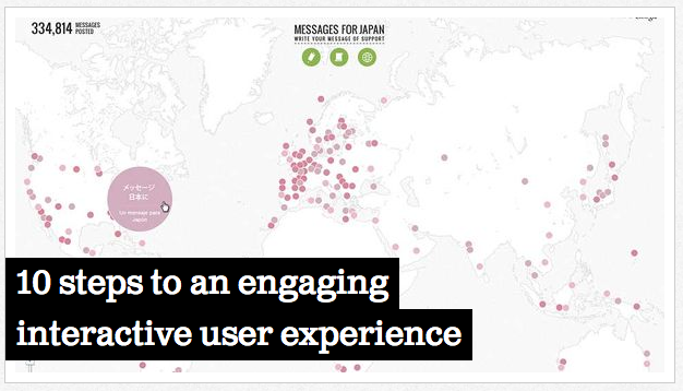
When a 9.0 earthquake struck Japan earlier this year, earthquake relief efforts and support poured in from around the world. Working with Google, we created a platform for the global community to share their Messages for Japan. Taking a cue from Fisher Price, the site featured big buttons to group messages into categories of “Love” and “Hope”, as well as giant input fields asking users to “Write Your Message” and “Make a Donation.”
7. Take cues from tablets
Because you’re already limited by the amount of real estate on tablets, the need to simplify interactions is even greater. Ask yourself if your design would work on a tablet. If the answer is yes, you already have the two basic building blocks in place for a strong user experience: clear hierarchy and intuitive way finding.
These are the same questions we asked when we teamed up with CBSNews.com to create an elegant and visually rich online news experience for viewers of America’s #1 news program, 60 Minutes.
8. Design your UX
Adding placeholders for copy (lorem ipsum) next to some gray boxes underneath a row of navigation links does not constitute design. Visual hierarchy, content grouping, spacing, positioning and size are all things that should be solved in wireframes before a visual designer even sets eyes on it. If in your wireframes you’re working within the actual site or application width, and 12px text in your template is actually 12px in design, you’re on track.
9. Collaborate with all departments
User experience design alone is not enough to make great work and it will surely not provide all the answers. Listen, collaborate and become the liaison between the client, the user and the rest of your internal team. Only then can you create the best possible experience for the user while still meeting all business objectives.
Remember, you’re not alone. UX designers, visual designers and interactive developers all have a hand in making a project a success – it truly is a collaborative and multi-disciplinary effort. When it’s a shared passion and everybody pitches in with their level of expertise and voices their opinions, magic happens.
10. Don’t grade your own homework
The chance of you hitting the bulls eye with your first shot is very slim so be prepared to design iteratively as you gather more information about the performance of your site or application. One of the things that I am adamant about is that you should only do quantitative analysis on your own work. Tracking the performance and understanding where people are dropping off is extremely important and should be done in-house. But a third party should always conduct the qualitative user data analysis so you can truly have an objective testing environment. Doing this in-house is much like grading your own homework and won’t give you the depth of truth and insight that you’re looking for. If you want real objective answers, let someone else do the user testing and take those learnings into your next iteration.


