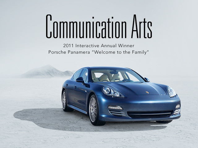
Fantasy Interactive is proud to announce that Commarts, the largest international trade journal of visual communications, has chosen www.panamera.com as best interactive of the year in the advertising category.
The Porsche team turned to Fi (digital agency) and Cramer- Krasselt (ad agency) for help in showcasing the much anticipated, game-changing, Porsche four-seat sports car as part of the U.S. Panamera launch campaign. The website encompassed more than 60 years of Panamera history, while serving as the central destination for all Porsche aficionados to learn of its roots and share their own stories and experiences.
The effort was part of a fully integrated “Welcome to the Family” campaign which included a commercial spot produced for TV by C-K. The early TV spot concepts were provided to Fi to generate the digital strategy and ideas for Panamera.com
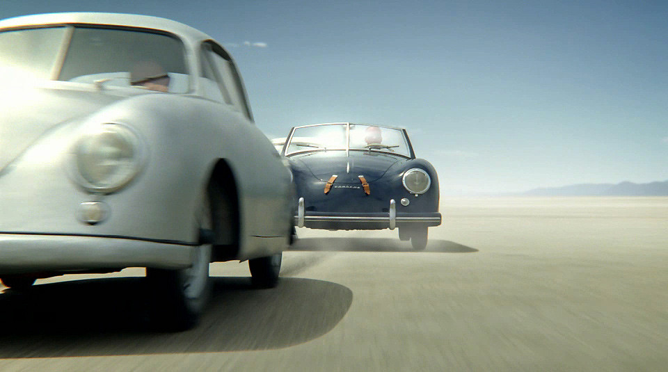
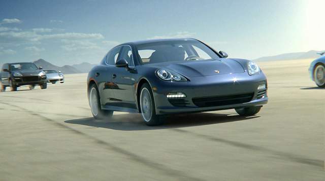
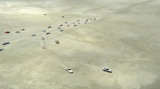
Here’s the original wireframe video of the TV Spot C-K was shooting. It shows how everything was storyboarded and modeled with attention to detail from the speed of the cars to the angle of the camera which served as a key starting point for creating the website.
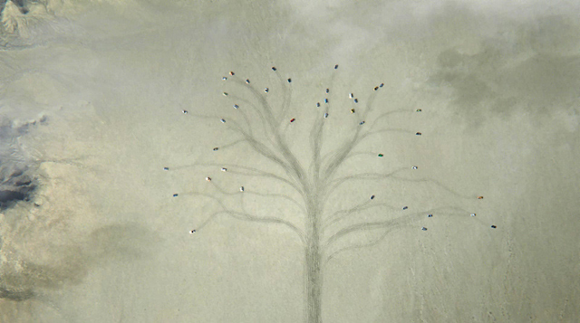
And here’s the final TV Spot with the Family Tree idea.
Once the commercial was set, we started to dive deep into the interactive project. A ‘Porsche room’ was set up in the Fi New York office where early brainstorming sessions took place, concepts were sketched out, interactions thought through and technical documentation drafted. It was Porsche creative craziness.
So to get rolling we first looked at the TV spot to immerse ourselves into the colors, tones, and the overall emotional experience. We needed to match the site look and feel with it and convey the passion conveyed in the TV spot to the web. After a lot of concpeting, we finally got a clear idea on how to translate the commercial experience to site.
Here is small selection of the screenshots that covered the “Porsche room” as we began.
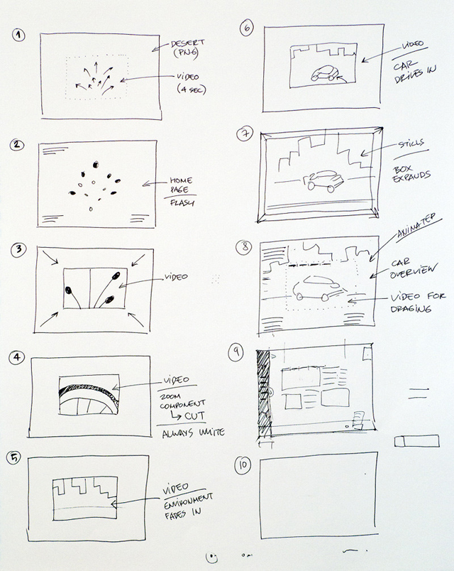
Now that we had a good grip on the overall approach, it was time for us to move on to initial sketching and concepting. From the start, it was decided that the individual cars would be modeled in 3D in order to provide a flexible and interactive format to showcase the models.
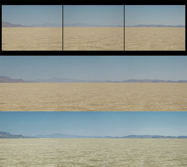
We received panoramic shots of the actual location used for the commercial and started stitching them together and working with colors and tones to make it match as close as possible.
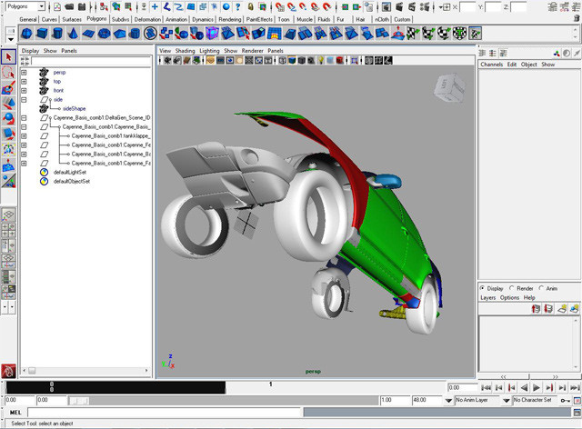
In parallel, Porsche had sent us the actual 3D files which were enormous. It was a big call. Do we try to animate and render out the cars ourselves to get what we want or do C-K try and shoot them in the desert during the commercial shoot? Both had pros and cons but we choose the 3D route.
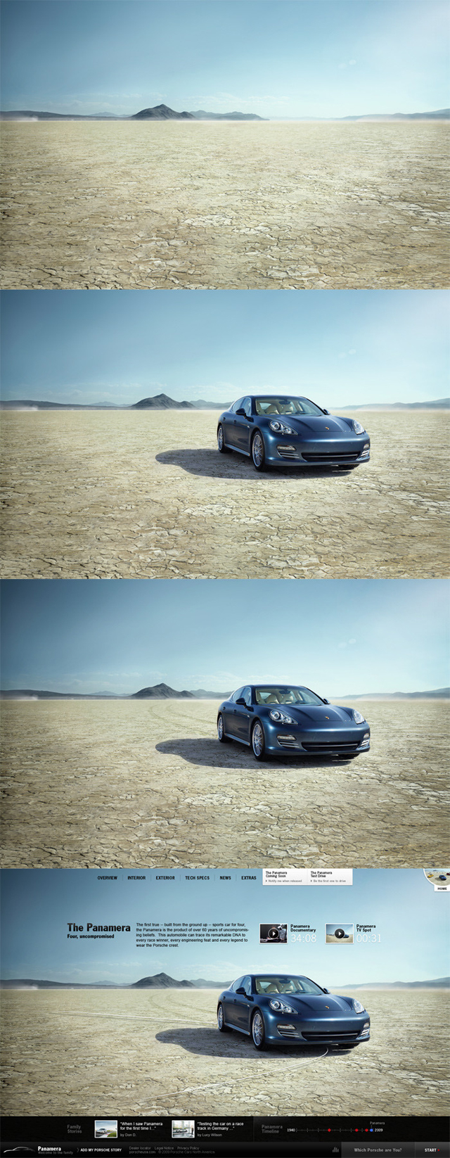
Positioning the 3D car on the desert scene after a lot of post production to the desert itself. Together with C-K we evaluated different crack sizes on the desert floor. We needed something close to the TV spot but also something that would work for the website in “still mode.”
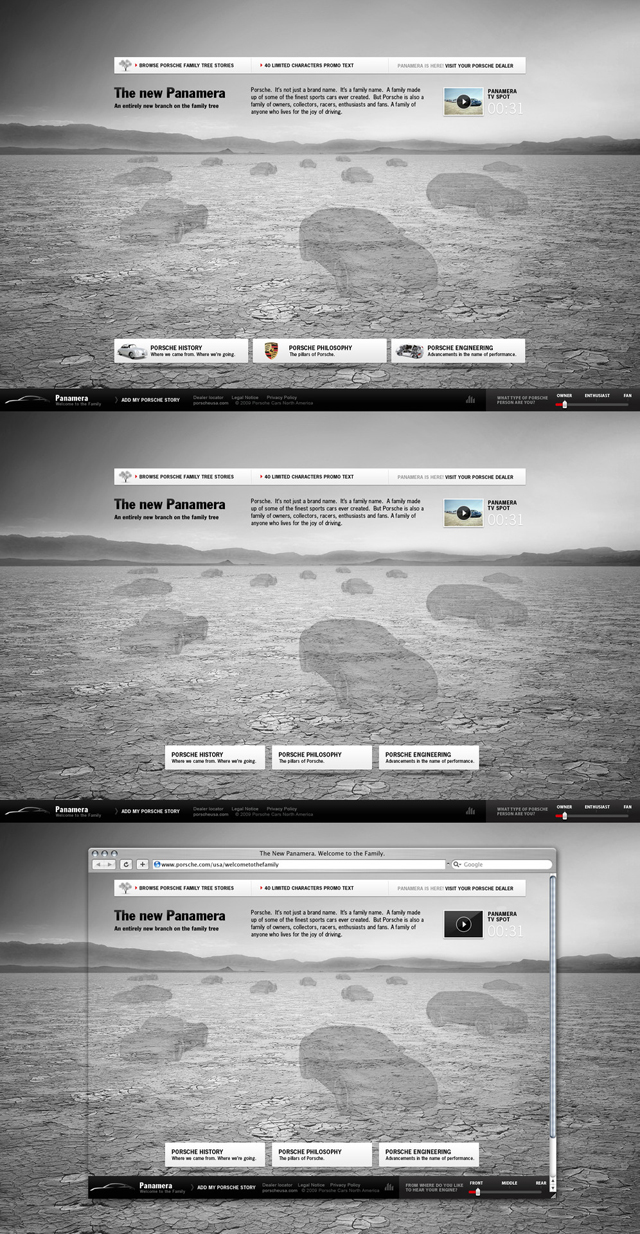
From the beginning we had the vision to ensure the site was “liquid,” so it would stretch with the user’s browser/resolution. Below is a quick mockup of the home page for the 3D artist with placeholders showing where each of the cars should be positioned. This was absolutely critical especially in a timeline with no room for delay.
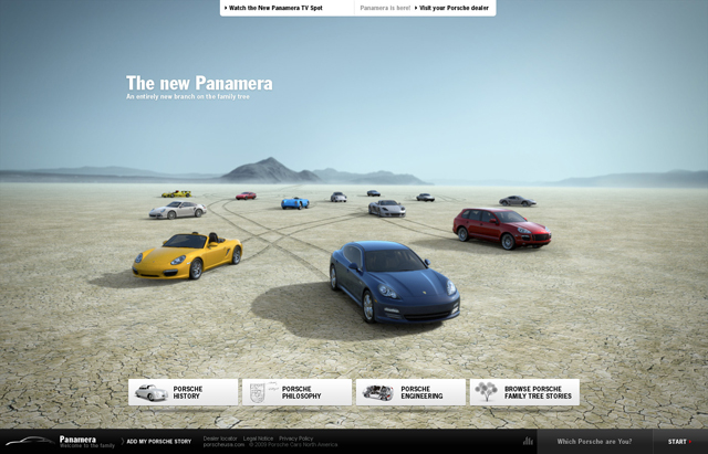
This is the final home page with all the major cars in the scene. We went through a variety of options to get the right angle, height and where the cars should be positioned. Early on the 3D renders where far from ready and Photoshop has to fake the layouts to simulate what we where going for.
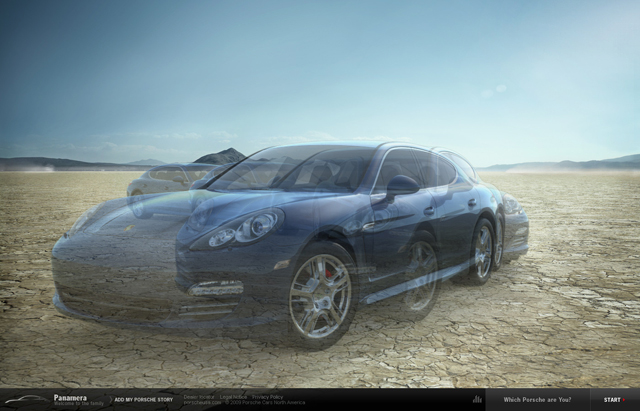
First 3D draft of the Panamera appearance on the stage. We were very concerned with how the Porsche vehicles would look on the site. Unlike TV, the user is inches in front of a huge HD display. There is no room for poor execution.
Unlike older automotive sites we have designed in the past, this time when it came to the user grabbing the car with the mouse and dragging it, we wanted a refreshing and innovative experience. By creating each individual image, we could assure that the experience would be as smooth as possible when the user would drag the vehicle in a direction.
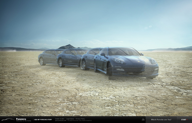
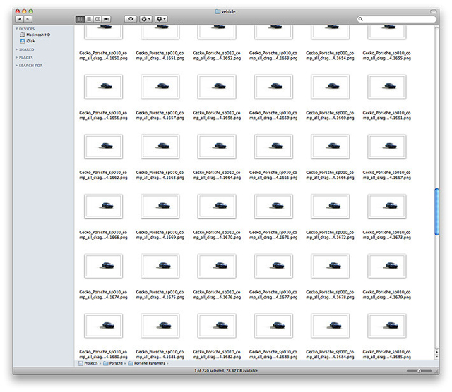
Each frame was rendered out as PNG.
One of the key requirements was to ensure each vehicle had its own environment for each of the Porsche models. Each scene was designed from a blank canvas to ensure each feel was unique and appealed to the individual vehicle characteristics. The starting point of interactivity was always the “desert” which allowed us to make the connection with the Panamera, but we wanted the option for users to see how the other key modela would look within their ‘real environment.’
For example, below is an urban environment for the Cayman.
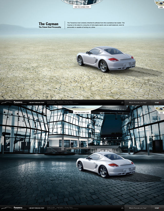
Here you can see an early render of the Cayman driving into the scene.
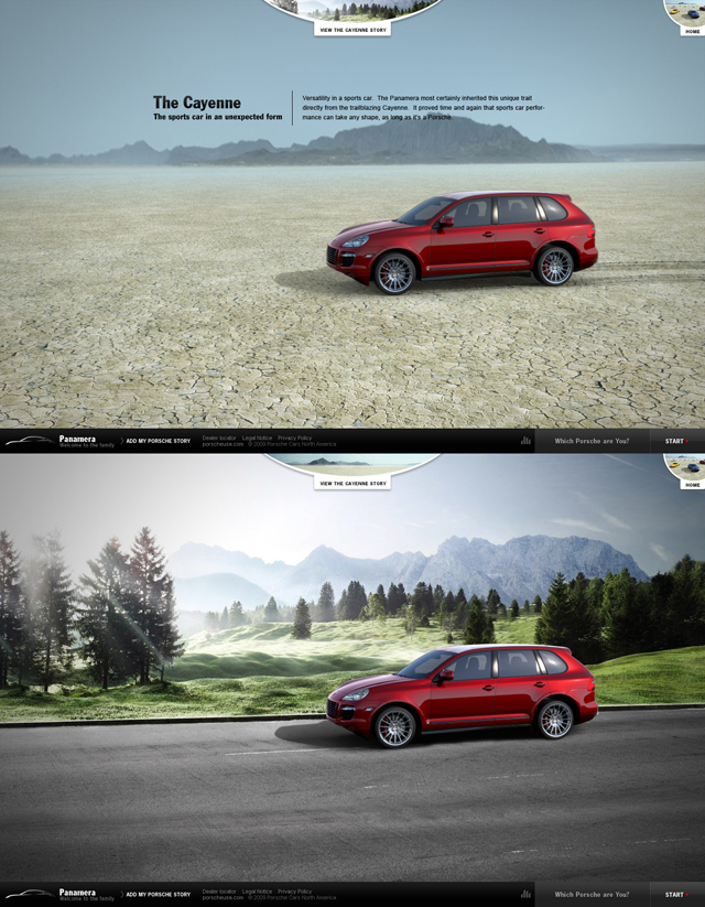
Because the Cayenne is more of a city car, we associated it with an Autobahn-like environment. In this phase of the project, we had to concept a large variety of environments for each vehicle but it was not easy. Scenes were built before we actually had completed the 3D render. It was tough to plot the size of the road and other elements without the show piece.
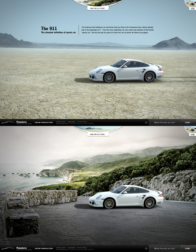
The coastal road for the 911 was a perfect match and one of our favorites.
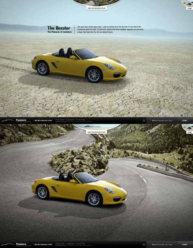
And finally, the Boxster was yearning for winding mountain roads, eager to take on the turns and grip like never before.
Because we know you love ‘behind the scenes’ extras, check out the view below to see how the magic was made. Here’s an example of the making of the scene for the 911.
You can find all behind-the-scenes videos here.
One of the key features of the large site was the idea of the “Family Tree” which proved to be an extremely effective destination to provide the Porsche audience with the opportunity to share their personal Porsche stories and interact with other Porsche followers, ranging from dealers to fans. This was created to welcome all the Porsche aficionados and allowing them to join the family by adding their personal story to the Porsche family tree. We wanted to give to everyone who owned a Porsche a place to tell their story, and through this experience, become a member of a long legacy of Porsche owners. We wanted to provide a place for users to discover the latest additions to the family, the Panamara, and also contribute to the history of the family.
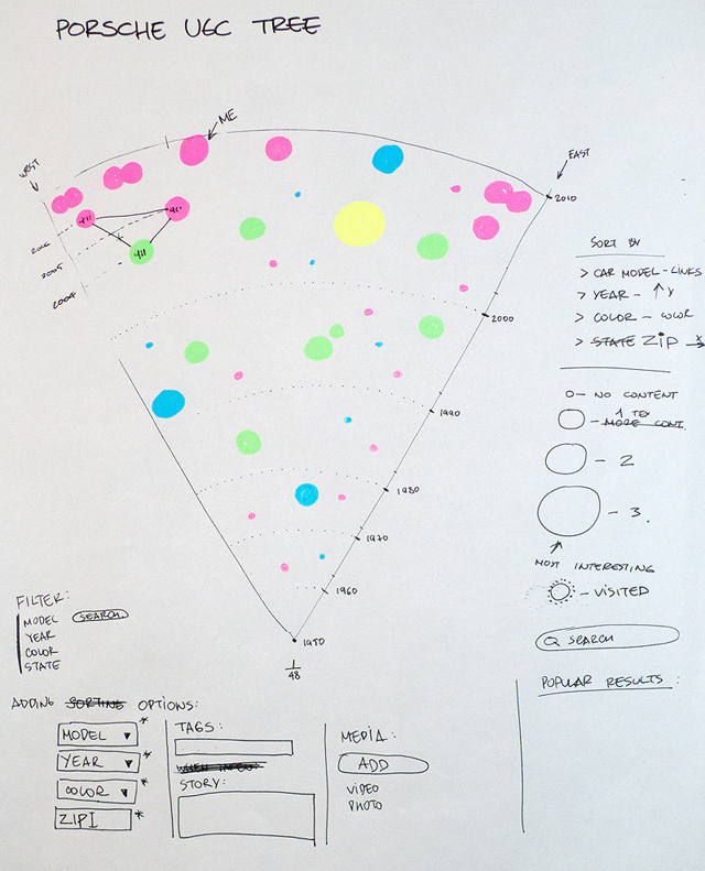
Below is the original sketch of the UGC Family Tree. You can see the way we wanted to split and organize the cars – older cars down near the roots, and newer cars all the way at the top. With this approach we outlined how everything would be tied together, providing a sense of history and uniformity. We also wanted to provide a sense of Geo-location through the interface, and thus we decided to position the east coast drivers towards the right of the tree and west coast drivers towards the left.
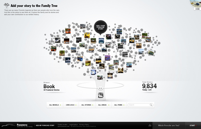
After we put some design magic, this is how the UGC Family Tree looked in the final designs.
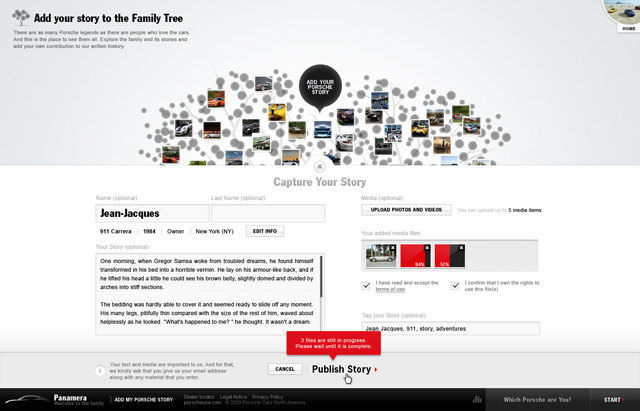
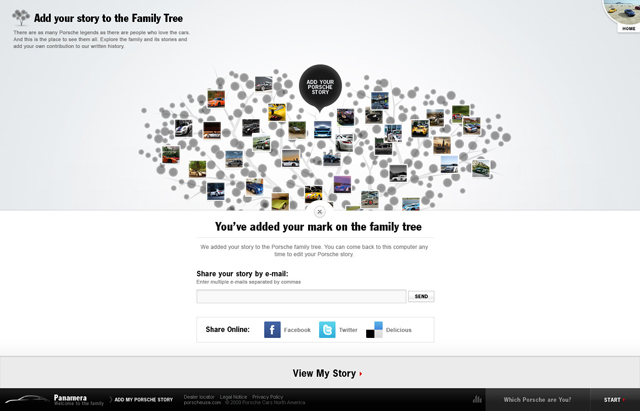
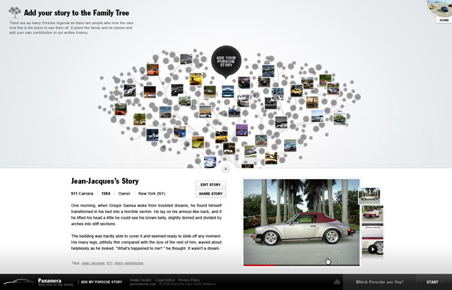
We felt it was essential to make the process of adding stories extremely simple, intuitive and quick, so we designed an interactive step-by-step process using big dragging sliders, simple option selections, and large drop-down menus. We wanted to make things as smooth and as elegant as possible and thus input fields were not an option. Thanks to our experience with UGC, adding your story was as pleasant as driving a Porsche (almost).
Below is a set of screens showcasing how easy it was for users to create their own story.
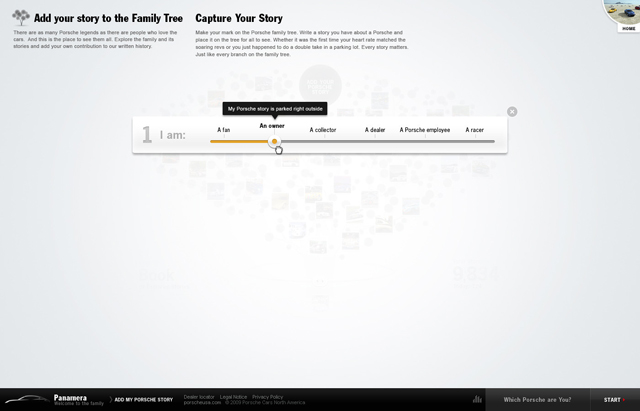
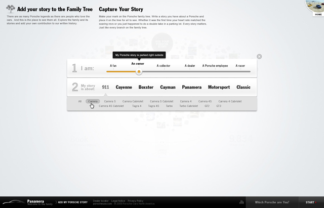
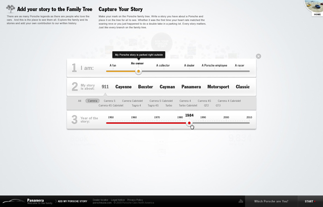
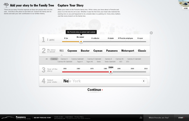
Another key goal of the digital strategy was to create ‘Lead Generation’ for Porsche so they could simply reach out to potential customers. At Fi we put a huge amount of energy into creating something innovative here, simply because we did not want to create an intrusive experience when it came to capturing a users email address. So we developed a very elegant and efficient solution.
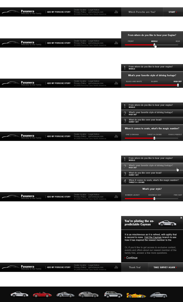
We designed a footer that will always present an interactive component asking users to define what type of Porsche driver they were. The experience ended by matching the user with the proper car and gently offered them to enter their email to receive additional information. We called the process the “Nintendo effect”, meaning let’s create something beautiful and well executed for a system that is normally traditional, boring and obtrusive. The result was hugely successful for Porsche.
Below are some components we created for this feature. Like the rest of the site, it was crucial for us to do it the ‘Porsche way.’ Porsche will go the extra mile to find the exact sound a door should make when it is closed and so we decided to take the same approach here. We put a lot of passion and effort to find the proper interface for users to enter their information and generate leads. And based on the result it looks like we were quite successful.
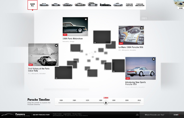
Because The Panamara is built to encompass the rich history of Porsche, the team decided to put together a nice and easy-to-use timeline allowing users to travel through time and explore Porsche’s history. It allowed us to highlight the on-going continuity and progress of design and engineering for each model. As you explore the timeline you can start to understand how common elements are shared among all of the models. It showcases the reality of the family notion when it comes to Porsche. In addition, this feature opened Porsche’s vault, granting users access to more than 20 current and historic Porsche models, with more than 35 hours of historical footage, hundreds of historical photos and 7 technical videos.
Below is a view of the timeline allowing users to fly through time using the slider at the bottom and quickly access key dates in Porsche’s history.
Here is a detailed view for Porsche’s first victory at the famous Paris Dakar Rally.
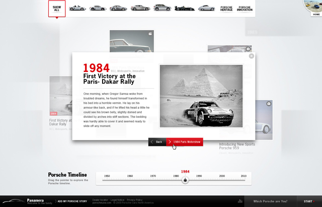
Below are some close-ups for some of the components introduced in the timeline. Users could explore the timeline by dates or models


Another key goal was to create awareness for the Panamera, so one of the main sections of the site was dedicated to the Panamera itself. We naturally wanted users to be able to learn as much as possible and be aware of exactly what kind of car they were encountering. From the information on the site, they could immediately recognize the car and tell their friends “Oh yes, this is the new Panamera from Porsche!”
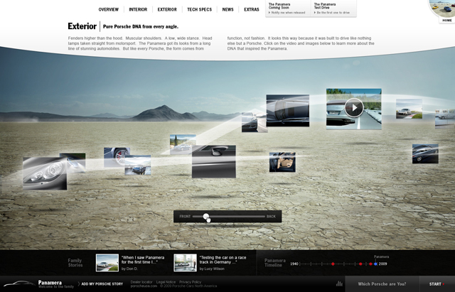
The image gallery wasn’t typical either. We positioned all of the photos on the car’s outline in their respective placements. For example, headlights were placed at the front. The gallery layout was based on the shape of the car itself following the outline of its silhouette. We used a ghost shadow of the car to organize the gallery.
Below shows how we displayed the image gallery of the car.
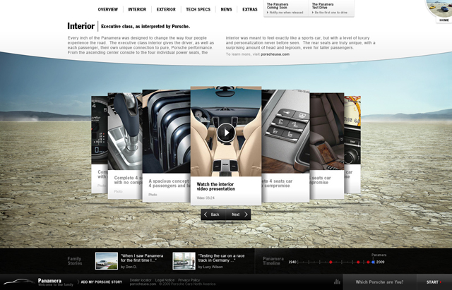
Below showcases how we displayed the interior of the car.
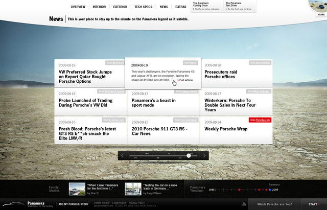
And here you can see how we are displaying news and updates.
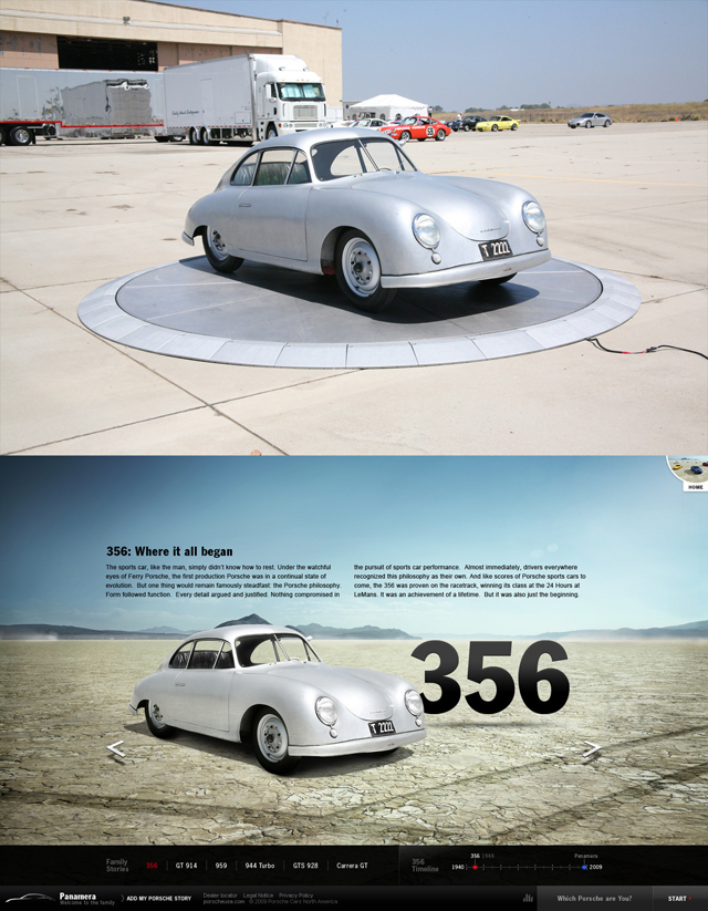
Because the Panamera was deeply tied to the Porsche heritage it was crucial to bring back a lot of historic and classic Porsche models. To keep the user experience as smooth as possible, we brought all these models into the same desert environment, creating an uninterrupted feeling for the users. In addition, we gave users access to a lot of information about the cars, and subsequently showed that there is shared DNA that makes each model part of the same family.
Here is a set of images showing the 356 model at its standard display and how it was incorporated after we brought it into the desert scene.
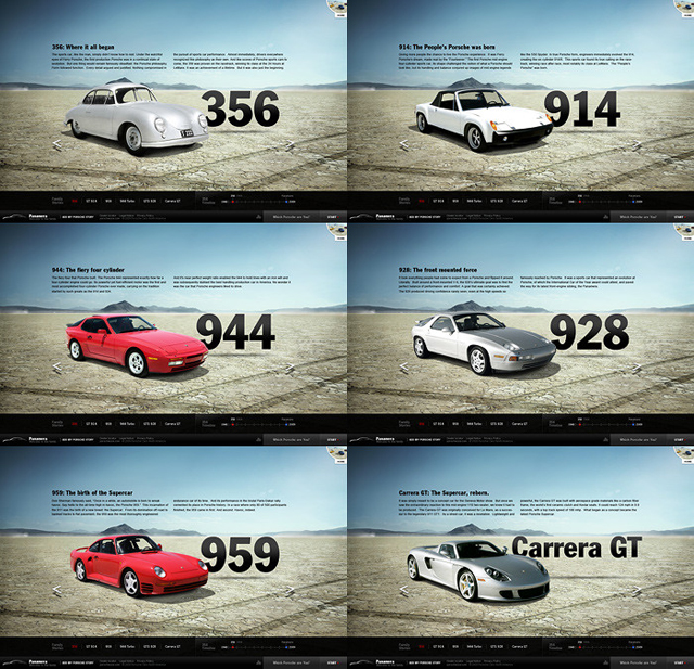
And here are more of the classic models we displayed on the site, using the same approach.
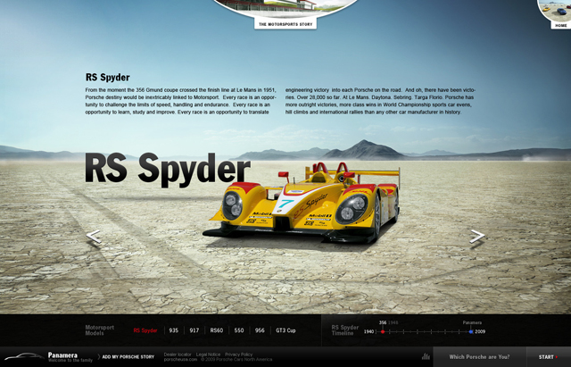
Of course the Porsche name has always been synonymous for cars that represent speed and racing. Thus it was key for us to bring this aspect of the brand into the experience. The Panamara is not just a regular family car. It’s a four-door, family, speedster, integrated with the racing experience of Porsche. We felt it was very important to bring this aspect of the brand into this project and we dedicated an entire section on the site to showcase the history of Porsche racing cars.
Here is an example of how we showcased a racing model and we’ll let you guess whether the RS Spyder was brought into the desert or not.
The Panamera project has been a great success for all of us here at Fi picking up an FWA, People’s Choice Award at The Webbys and now The Best Interactive of the Year by CommArts. This multi-award winning project has given Porsche a digital experience that is truly reflective if its brand, heritage and products.

It