Back in the early days (1999) Fi was knows as “Fantasy Interfaces”. I would often get the question why “Fantasy”? Or when I meet someone new, during a casual or business conversation they hear I work with the internet in some company called “Fantasy something” I often got a smile, a kind of “oh really” smile. But there is some logic behind the name. Growing up I was always fascinated by sci-fi movies that had these amazing holographic user interfaces or GUI’s. I had no idea what to call these things, some kind of Hollywood interface perhaps?. I Altavista’d day in and day out to find the right term. Nothing!…
During my research the gorgeously executed movie “Final Fantasy - Spirits Within” had just come out and had it’s own amazing GUI interfaces. The minute I got home from the theater I rushed to the computer, made the logo for a new brand called “Fantasy Interfaces” which described these gorgeous GUI’s I thought the internet should be fully made up of.
The mission of the company was to bring a natural, intuitive and a beautiful interactive experience to internet users. That mission is still our primary focus today at Fantasy Interactive or as some may refer to us as; “Fi”.
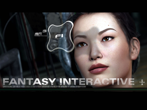
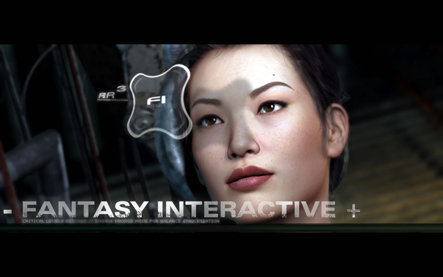
A screenshot from the movie Final Fantasy in which we placed the Fi shield. This promo graphic was made to promote the name change from Fantasy Interfaces to Fantasy Interactive. RR3 stood for Revolution 3 as in the 3rd version of the company’s website.
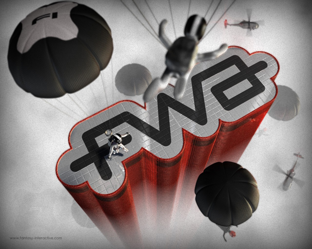
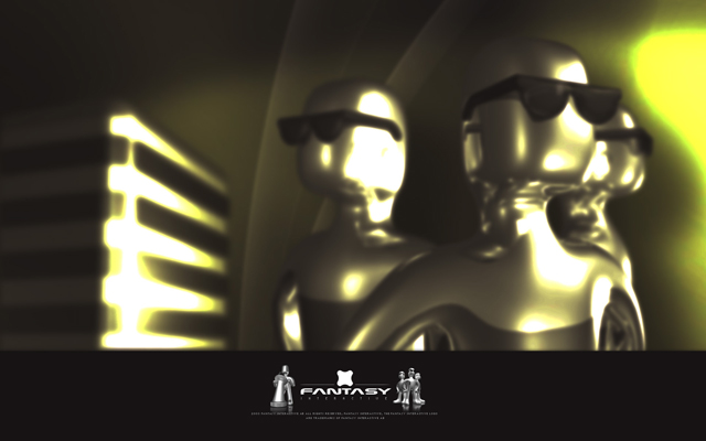
As we became more comfortable with the brand we designed our own characters that represented the typical personalities within the company. We also transitioned from the longer name to the abbreviation “Fi” for several reasons. I will never forget reading on flashkit.com some user referring to us as “Fantasy Intercourses” because of our passion for flash and believed HTML was beyond dead. What a suicide mission that would have been if we’d continued on with that opinion. Here we have an FWA themed wallpaper, I think we were one of the first to send them in when it started.
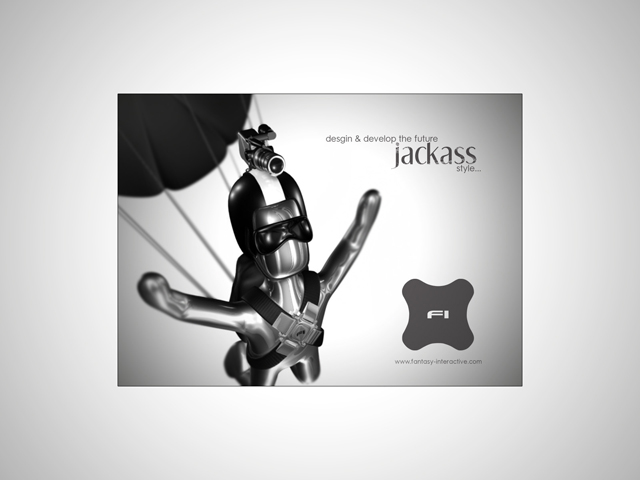
One of my favorite wallpapers of all time was this one below done by the almighty King K (Krister Karlsson). We hired Krister in ’01 as a Photoshop designer whom had 3d experience. Krister was probably one of the most creative and artistic people I have ever met and he would pump out these great 3d graphics in minutes and this was way before other agencies and websites even used 3D for “web design”. The “jackass” thing was us immaturely branding the internal company mindset after watching way too much Johnny Knoxville, good times!
“Ignition” was the term I gave to a motion graphics flash movie. I recall it was made in 13hrs or something from start to finish including the 3d models and animations in it. Back then the great flash motion designer Eric Jordan from the company 2Advanced also pumped out incredible motion material. It was like a friendly war, one always trying to trump the other. The huge flash intros we would make for client sites were insane, true flasturbation. Below was a terribly executed wallpaper (which looked awesome back then) that celebrated the Ignition project.
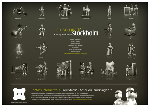
Are you mad? Yes we were- in order to make this silly image as an ad to be placed in a Swedish magazine. We always had problems hiring in Sweden. All our clients were American. When we would meet designer or developer Swedes they were shocked to find out we were a Swedish company based in Sweden. If you click the image and make it bigger, check out the characters I was referring to above which referenced the type of personas we had. Some pretty creative stuff but better used as a wallpaper which this was later transformed into.
I always loved the word “Fantasy” just how it flowed, the futuristic feel of the letters coming together, the way the F started it, rolled nicely into the A and the N and T would stabilize the middle of the word when the second A would drop into the S and flick off with the Y at the end. I wanted to get rid of the “interactive” part of the name and just be “Fantasy”. But the url was $7 million.
Some early logo work for Fantasy Interfaces. I basically took the font “Nasalisation” and stretched it. I loved NASA as kid, it was one of the great things about America to me. I had to use their font in my “change the future” company.
Got a little excited about the filters in photoshop.
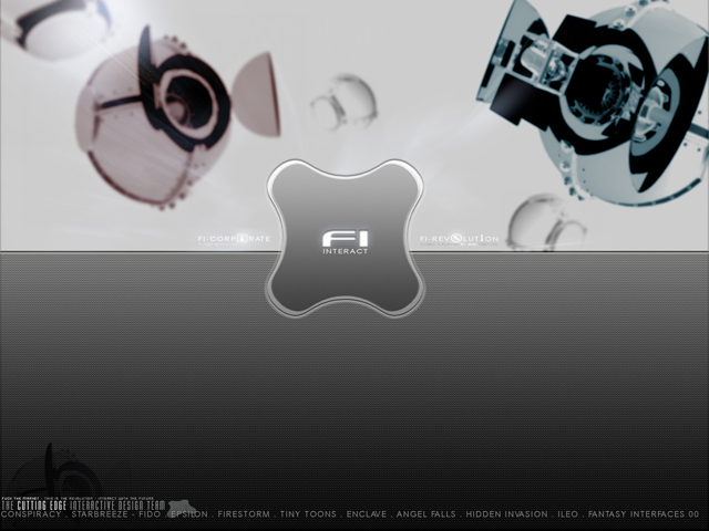
Moved then to the abbreviated name. Jesus, would you look at that thing. Is the company called Fi Interact or is “interact” the slogan? It was the slogan. What an idiot.

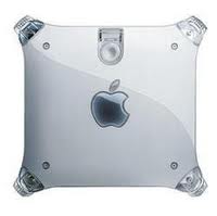
So the name wasn’t working well. We were pretty popular- we had landed Microsoft Xbox, Time Warner Cable (Road Runner) and a few other big names. Most folks that could do flash stuff back then knew the company or had seen work we had done. I got a little cocky, I decided we need a symbol, we are big enough now to be a house hold brand. The font of the month was “dot matrix” as you can see below which was the first step in transitioning the name out and bringing the symbol in. The “shield” as we call it to this day is one of the best things I feel I have designed. I wanted something super simple like a square or a circle. So I combined both to get the “Fi Shield”. That day I got a little help when I noticed a g4 mac from the side and felt there was something there but needed tweaking.
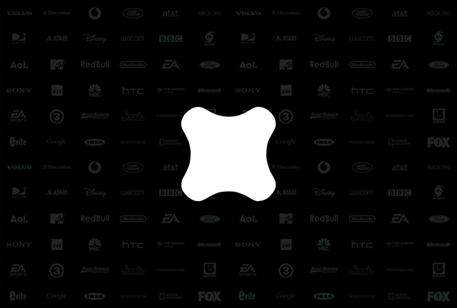
Today my desktop is this. Simply a bunch of logos of brands we work or have worked with which remind me of the influence and success we have had. It’s still a Fantasy to upgrade the user experience on the web and now mobile and TV etc to a point where I can feel we made it…Although we have made some progress, we have a long way to go.
Yours truly ![]()
David Martin
CEO of Fi