When Nickelodeon came to Fi for their flagship app, we were giddy with excitement. The app ranked #1 in the iTunes store and we are proud to announce that the Nick App has won an Emmy for Outstanding Creative Achievement in Interactive Media – User Experience and Visual Design.
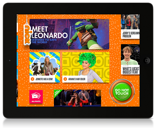
To honor the “random hilarity” and “disruptive comedy and surprises,” we’ve asked some of the team responsible for these features which ones are their favorite, and here’s what they said!
Yuwei, Senior UX Designer
#2 Menu Tag & Light Effect
The menu tag hangs and swings on the top left conner for the user accessing the menu easily. The menu tag is designed as a light switcher. When pulling down the tag, the screen turns dark and transforms to a stage where Nick characters stand. The user taps a character to visit his/her world with all related content.
Vishal, Senior Technical Manager
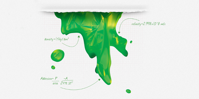
My favorite part of the app is by far the slime!! We made a digital version of slime where you can interact and play with it even in a two-dimensional experience! Our next goal should be to make an interactive slime experience with a leap motion device and wearing a google glass!! How cool would that be ![]()
Another favorite from the tech team was the Nick logo!! We had quite a few fun, nerdy sessions brainstorming the physics to give it that true-to-life dangling experience!!
Sarah, Associate Production Director
I can’t decide on my favorite feature, but we had one motto when we were making the App: “Add more Fun!” Everything we did we looked at it and basically said ok this is good but make it more fun for kids. Yuwei and Sacha did an incredible job on this and surprisingly it’s harder than you think to increase fun and understand what kids would like.
About Fi
We are Fi. A Digital Design Agency that specializes in the architecture, design, and development of award-winning digital experiences. With a specialized focus in creative strategy and interaction design, we approach engagements with a heavy bias towards aesthetics and innovation within the digital space. Founded in 1999, Fi continues to work with some of the biggest brands such as USA Today, Google, and Microsoft.

When the FI will launch the new site redesigned?
when is the new fi coming out?
That’s HUGE. Congrats.
ISHHHHH !!! Congratulation.
awesome guys!
virtual high5
Many many congrats and keep on creating magnificent work!
Congratulations!!!
congrats guys, work of Fi is so inspiring, keep em coming