With the exponential amount of information available in this computer age we live in it can be difficult to process it all. Sometimes our clientele approach us with numerous facts and figures and it’s our challenge to transform the data into visualizations that generate an engaging user experience without compromising functionality and truth. Sorting, categorizing and displaying the facts with an engaging creative output tends to generate increased time spent on the experience and decrease bounce rates. Let’s take a look at a few examples, Stocks, History and Google.
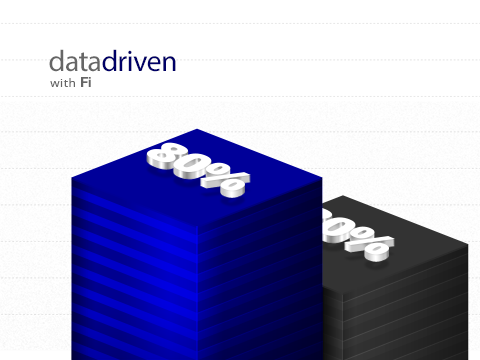
A visual stock market?
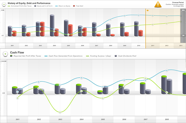
One of our earlier examples of data driven work is the Skaffold app that takes a daunting topic, the stock market, and makes it obtainable for the people who want to invest but haven’t taken the leap because they may feel overwhelmed.
1) Big and Juicy Visuals
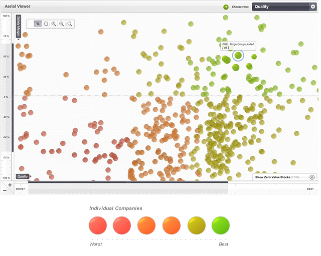
One challenge was to display the entire stock market in a single view without added confusion. It needed to be digestible at a glance, provide all the information that would be important to the user while conforming to the space available. Our solution was a traffic light graph system to keep the ‘stocks’ visually organized so it doesn’t feel overwhelming to newcomers, but the in-depth information is still available by clicking a specific stock bubble.
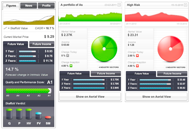
2) Real-Estate Negotiations
Space is in demand when you move from desktop to tablet or mobile devices so we made it easy for users to show or hide information as needed through panels. Each design choice has to bring value to the user – choosing the best representations of the data, followed by color choices, is the key to a successful visualization. In this case bright colors and simple, clean graphs help facilitate understanding.
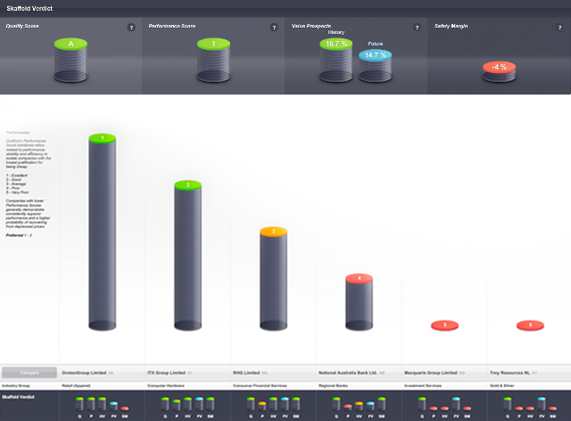
3) The Onion Strategy
More straightforward charts keep information uncomplicated so a quick glance can be enough to check in on your investments, but the detailed information for the hard core investors is still available when you peel back the layers and explore the graphic a little further.
Waging War on Lame Data Graphs
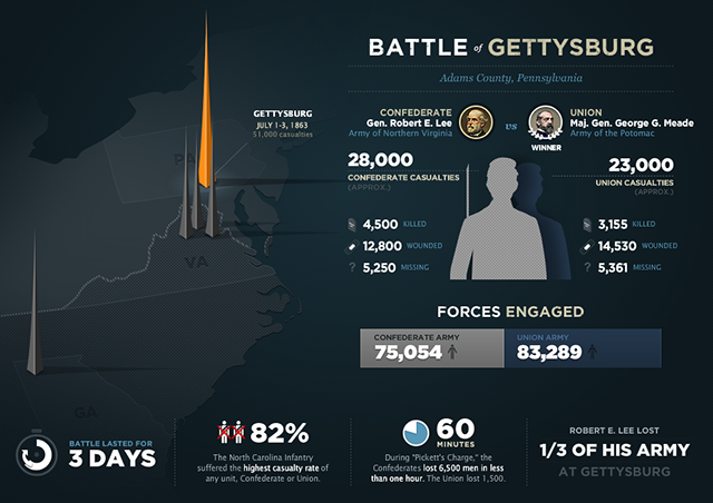
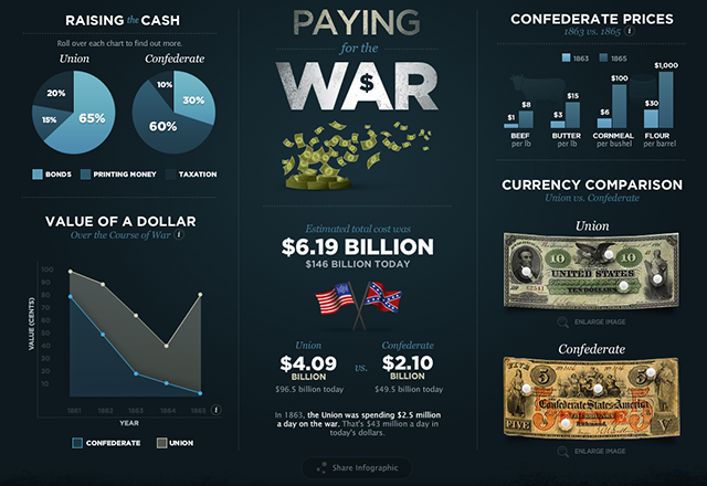
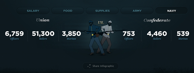
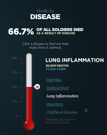
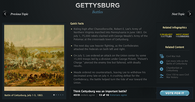
Another example of our data driven work is The History Channel’s commemorative portal for the 150th anniversary of the American Civil War. After all was said and sorted, The History Channel received many letters of appreciation for this microsite from users ranging from Civil War buffs to teachers and their students, and it was even inducted into the US Library of Congress.
1) From Excel to Exciting
When the project began The History Chanel provided us with a document that listed thousands of facts about the Civil War.
2) Eye Candy
With our infographics we are able to show locations, visual comparisons and numerical facts while keeping a clean, easy to read aesthetic. We chose not to display facts in a boring list, instead we turned the facts into a beautiful collection of visual data and interactions. Again, choosing the right style of graph or chart was the most important step for organizing this information and we used a selection method to display more information in the given space.
3) Keep Them Coming Back
Diving deeper into the site you can find an extensive collection of organized information with images, quick facts and links to more information. Having a “Vote for it” button is a great way to keep the users engaged and thinking about the information while exploring the site.
‘Charting’ the World of Data
Each year we help Google break down and display the world’s curiosities through search terms with Google Zeitgeist. Google compiles endless facts and figures based on anonymous information they collect regarding who, what, where and when people are searching the Internet and we turn them into usable graphics that make sense.
1) What, Where, When
Google tracks the location from which a specific search term is typed in and we visually compare which countries are searching for what. This is a great way to learn about cultural differences and can spark an emotional response for the user, triggering increased memory of the information.
2) Animation Nation
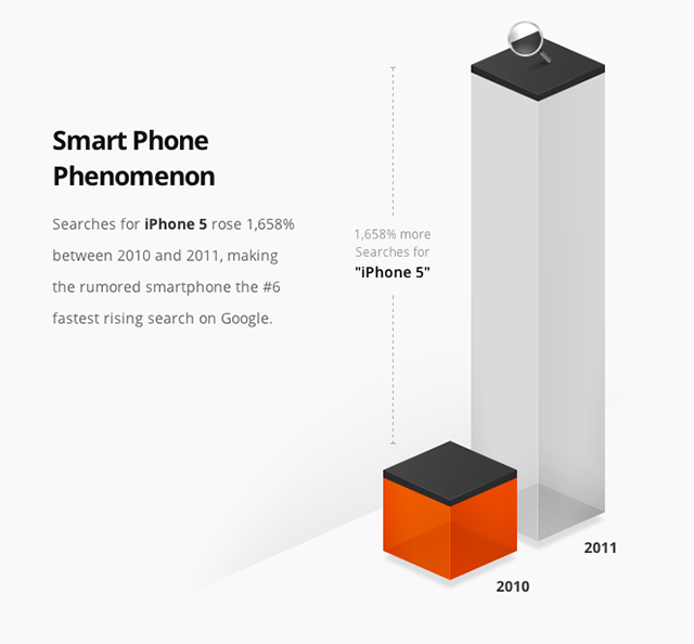
Comparison graphics like this search for ‘iPhone 5′ are a great way to show increases and decreases in searches over time. However, we found that a static chart is less likely to grab a viewer’s attention than an animated one. Each section you scroll to on the Google Zeitgeist site animates in and leads the user’s eye where you want it.
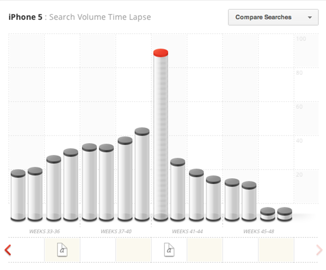
3) Context is Next to Godliness
Users can scan through the weeks and view search volume comparisons, complete with links to the most popular articles of the week below the graph – because what’s a graph without corresponding information?
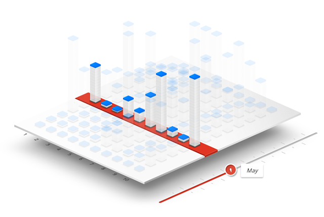
This is our interpretation of a year’s worth of searches – the slider bar allows the user to highlight a specific month while the ghost images keep the comparative information in view for reference. The stacks represent the number of times a specific term was searched for, globally or for a specific region depending on the user’s choice.
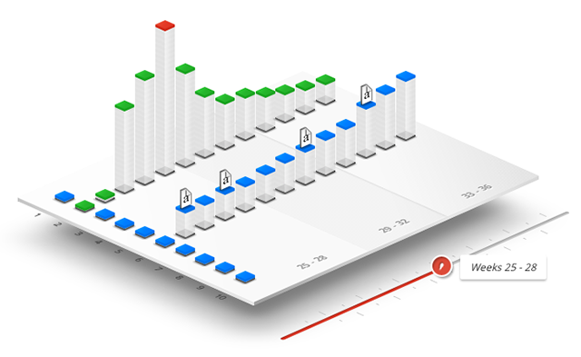
By selecting more than one topic a user can compare search volumes for specific time periods, as well as link to related articles, to see which terms were more popular. A Google color code distinguishes each search term and highlights the highest search volume for the selected time frame.
Interactive Delights
This conceptual piece we created was a fun exercise in some serious visual data experiments – we called it “Google Think Insights for Search”.
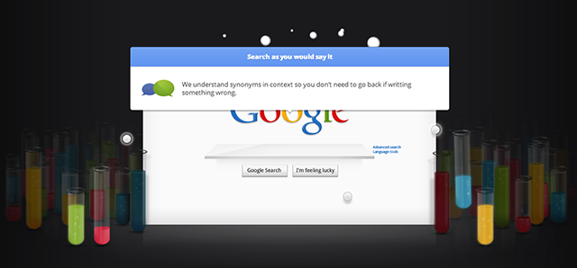
1) Create Chemistry With the User
Interactive test tubes allow the user to ‘pour’ the liquid into the search bar to generate random facts about Google. This type of interaction engages users beyond simply typing in the query and they will generate more Google facts as they continue to try different tubes.
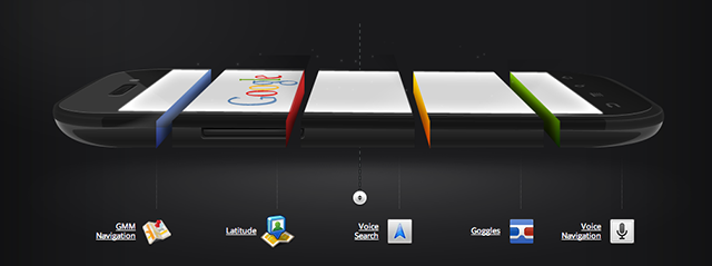
2) No Matter How You Slice it!
We used the source device as the graph this time! Here is a depiction of a mobile search breakdown. The user is engaged by ‘pulling’ the device apart to reveal the sections.
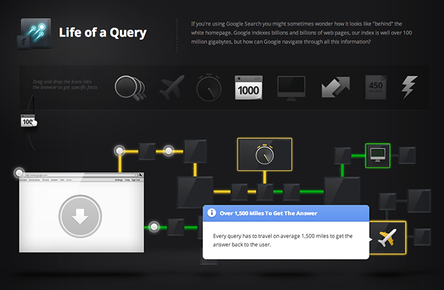
3) Go With the Flow
Flow charts are a fun way to show the user what is ‘theoretically’ going on behind the scenes when Google searches for a term. Each piece has a cool fact associated with it that the user can reveal by clicking on the graphics.
We  Data
Data
We’re all about alluring graphics and we really love it when our graphics have meaning behind their beauty. Data driven projects are educational for us and we enjoy helping the world understand what the information means through visualization. Notes, details, evidence, documents and lists are so easily transformed into something better, emotional and digestible.
About Fi
We are Fi. A Digital Design Agency with a specialized focus in creative strategy and interaction design, we approach engagements with a heavy bias towards aesthetics and innovation.
Some might say we are disruptive.
Re-imagining Travel (featured in WIRED)
http://www.f-i.com/fi/airlines/
Re-imagining E-Com (Wacom.com)
http://blog.f-i.com/the-new-wacom-com-a-product-site-that-inspires-you/
Re-imagining News (USAToday.com)
http://goo.gl/4fLqt
Re-imagining the App Store (Google Chrome Store)
http://www.f-i.com/google_chrome_store/


Nice
Useful!